Now that all of my illustrative elements have been drawn, I can bring them onto the double page spread and set them within a specific style to convey an infographic. This is something that I am really looking forward too because I want to see my original sketch come to life! But, during this process I soon discovered a piece that needed changing and developing, this piece can be seen below along with the completed infographic:
Large Hadron Collider with Explosion
This is the Large Hadron Collider illustration which takes up the entire right hand side of the double page spread. While nothing was physically wrong with the illustration, I soon realised that the edge to edge positioning of this piece looked out of place, and even with it slightly reduced, the edges were too straight and rigid to fit in with the overall infographic illustration. So, I decided to experiment with two potential fixes – removing the surrounding light pink edge or turning the edges of the illustration into a ripped/torn paper effect. My experiments can be seen below:
Both of these experiments worked very well, but I could already tell that the torn/ripped paper edges for the illustration would be the best fit for the final piece. While the removal of the surrounding background worked well, it just made the illustration look incomplete, the surrounding edge needed to be there. Which left the second experiment as the best possible outcome. In truth I was leaning towards this aesthetic because it would make the most sense within my illustration, so I am incredibly happy that it worked out so well!
Above I have placed both the starting point of the infographic and the final infographic piece. From here you can see how all the illustrated pieces fit into the final design and how the developed Large Hadron Collider better suits the overall design for this infographic. I think the change of creating a torn paper effect around the illustration better adds to the theme of a ‘police investigation board’, especially since the illustration can be ‘held down by cellotape’. Overall, I am really glad with how this infographic turned out, I think it works really well and suits the illustration style I have worked with throughout the project.
For my Large Hadron Collider Conspiracy Plan, I had 5 different illustration elements – torn newspaper effect, the Large Hadron Collider with an explosion, the Antichrist, the Hindu God, Shiva and the Egyptian God, Osiris . I wanted to focus on the illustrations first as images alone and later on add the text elements outlined within my planned sketch – allows me to follow the plan of creating each illustration individually and to bring them onto the background as a complete illustration, and also experiment with drop shadows etc. My final 3 illustrations can be seen below:
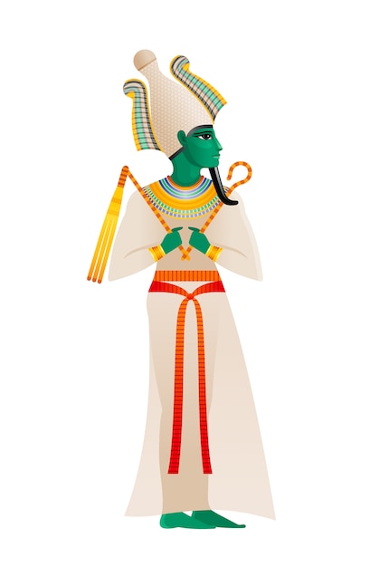
Osiris
This was my first time drawing a human figure, which is something that I have always struggled with, so I relied heavily on my reference images to create this illustration. This piece was created on Adobe Fresco and due to my previous illustrations, I knew how to include the colour scheme in a consistent manner to ensure the illustrations for each conspiracy theory connects wells. This illustration was one of the easier pieces to fill with colour, and I followed the same aesthetic as my previous work. For this illustration, I used the fill bucket tool to add the colour, which made the process extremely quick and easy to complete. I made the decision to not include facial figures because I was unsure of how they would look on the completed infographic due to the surrounding illustrations that could potentially cover it as well as how well they could be see due to the small scale this illustration was drawn at. Overall, I am quite proud of this piece, and I think it clearly represents Osiris within my own illustration style. When the illustration was complete I was unsure on how the background should look. On my original sketch I wrote how this illustration should be seen as a wall carving, but due to the addition of colour, I soon realised that this idea would not work. So, I looked around for inspiration and soon discovered an egyptian wall taperstry that worked perfectly for the background of this piece. I have included my reference images below:
1. Osiris
2. Egyptian Wall Tapestry
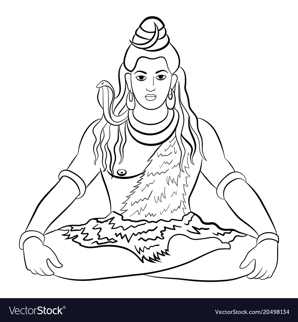
Shiva
Much like the Osiris illustration, I relied heavily on my reference images because I have very little confidence in drawing a human figure. But, for this illustration I was sure to add certain elements that I listed within the Critical Research blog post, that documented the key points that Shiva is always seen to be with or have around him. In my research, I soon discovered that Shiva is mostly depicted as having blue skin, but as my colour scheme doesn’t include blue, I decided to use the burgandy which was picked from the Large Hadron Collider moodboard. Again, the use of my colour scheme came in incredibly handy, and helped me to easily and effectively fill in the illustration to ensure a consistent look across all illustrations. This piece was created on Adobe Fresco, and as mentioned above, I made sure to add certain elements to my Shiva illustration, such as his third eye (middle of his forehead), his Tripuṇḍra (the three lines across his forehead) and a trident (the top of the trident can be seen above his right shoulder, hopefully signifying that it is strapped to his back). These elements were very important to include, and I think they add more accuracy to my illustration of Shiva. Due to the Osiris illustration, I was already aware that I wanted to leave his face blank with no features apart from the third eye and the Tripuṇḍra, this is a key element I want to include with all human figures I have to draw throughout the conspiracy theory project, hopefully there will come a time when I can practice and develop my people drawing skills!
3. Shiva Outline
4. Shiva’s Trident
5. Shiva
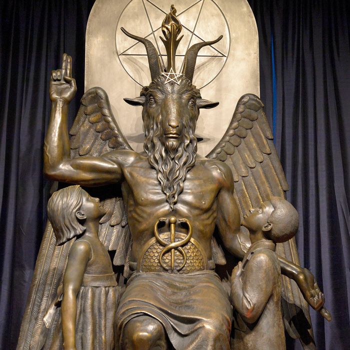
Antichrist
For the creation of this piece, I took inspiration from a statue of the Antichrist (called the Statue of Baphomet). I had previously seen a similar statue on a Netflix TV show called ‘The Chilling Adventures of Sabrina’ and knew that it would become a good representation of the Antichrist for this piece. I again used Adobe Fresco to illustrate this piece, and like the previous two pieces, relied heavily on the colour scheme and lack of features on the statues face. When I was creating this piece, I knew I wanted to include the pentagram shape within the background because it act as a strong signifier for the Antichrist/Devil persona. Overall, I think this illustration is quite strong, and clearly represents the Antichrist figure, which is what I wanted. As well as this, the colour scheme works extremely well and keeps a consistent theme throughout the Large Hadron Collider infographic illustration.
For my Large Hadron Collider Conspiracy Plan, I had 5 different illustration elements – torn newspaper effect, the Large Hadron Collider with an explosion, the Antichrist, the Hindu God, Shiva and the Egyptian God, Osiris . I wanted to focus on the illustrations first as images alone and later on add the text elements outlined within my planned sketch – allows me to follow the plan of creating each illustration individually and to bring them onto the background as a complete illustration, and also experiment with drop shadows etc. My first 2 illustrations can be seen below:
Torn Newspaper Cutting
Due to my previous Conspiracy Theory, I had already learnt how to create a realistic torn paper effect for a newspaper illustration. Which made this newspaper illustration quite easy to accomplish. Just like before, I used Adobe Photoshop and followed the tutorial, although, for this design I was much quicker at deciding on how the newspaper effect would look for this piece because I had already experimented with different aesthetics when trying to develop my original newspaper style – the cartoonish, out of place design one! For this newspaper, I wanted the headline to be very direct and clear to ensure the audience know what this infographic is about. In addition to this, I used a paragraph of my own writing from when I completed the Critical Research for this Conspiracy Theory to become part of the article text, removing the Lorem Ipsum type and making it look more realistic. To keep the design consistent with the newspaper design on my Hollow Earth Infographic, I made sure that the font I used was ‘Courier New’ – I want to make sure that my illustration style is evident throughout the different infographics.
Large Hadron Collider and Explosion
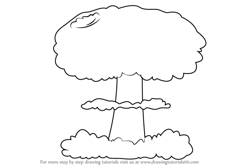
For this illustration I focused on my original sketch, and built from the original to the piece you see above. This illustration is the biggest piece for this infographic, and due to the fact that it takes up half of the double page spread, I wanted to make sure that it stayed as effective as my peers and tutor said it did in the original sketch. I didn’t want to add any more details because it would then become to engaging and my other illustration elements would lose visual power. Just like my previous illustrations for the Hollow Earth, I followed the colour scheme to the letter and instead, incorporated the burgandy when working with Adobe Fresco – leaving green to be the Hollow Earths engaging colour. With this piece finished, I am happy with the way it looks, I think the colour scheme works well and the visual aesthetic of the Hadron Collider can be seen behind the explosion. I decided to focus my explosion on a mushroom cloud because it worked best within the composition, I think any other explosion would have covered the Hadron Collider Illustration up to much. For this illustration, I worked with two reference images as guides, they can be seen below:
1. Large Hadron Collider
2. Mushroom Cloud Explosion Outline
I thought it would be best to place a screenshot of how this infographic illustration is coming along in Adobe Illustrator. Ofcourse I have three more illustrations to complete, but at the minute, the illustrations finished so far work well with my original composition idea. I think the newspaper is working really well and follows my guidelines very closely, but I am unsure about the positioning of the Large Hadron Collider. I originally had it placed from edge to edge, but with the addition of the papyrus background, I now think it looks out of place – especially since nothing in the Hollow Earth infographic is seen to be set edge to edge. I think it is important to change this position, and either reduce the size so the edge of the papyrus background can be seen behind or to re-design the illustration altogether. At the minute I am thinking of either removing the light background seen at the right hand side and making it so the papyrus background is visible instead, or by following the torn newspaper tutorial, and seeing if I can replicate the style but with an image instead of text, hopefully ending up with a illustration of the hadron collider that looks like it has been torn out of a newspaper or book. This is something I need to experiment with, but at the minute, I am happy with how the infographic is slowly coming together.
When we recieved our first brief for the Options Project, we were all pre-warned that a few weeks before the deadline we would be recieving another, smaller project to complete by the same deadline of Conspiracy Theories – well, here is that brief! This brief focuses on a 2-week timespan to design a series of commemorative stamps. The beginning of this brief is the exact same as the Conspiracy Theory brief, the only difference is the task assessment itself – I have placed the brief below:
Lets cover the basics first. The due in date for this project is on Friday 11th December and from the title of the brief, its very easy to understand that we will be focusing on Commemorative Stamps. This is the second part of the Options project, the first being Conspiracy Theory. Like every project, all work must be my own and made for this project, if needed we should reference anything used to avoid accusations of plagerism. Any work delivered after the deadline (unless otherwise stated by the tutors) will be failed immediately. Finally, everything should be included within my blog and clearly labelled for the ease of finding my work. With that over, lets move on to the complicated stuff:
The Principal Objectives
To focus on the specialisms and professional aspects of either illustration or photography
To undertake the creation of imagery for a specific audience and purpose and the setting of this in a graphic design context
To consider future career options within a specific pathway
Everything written in the principal objectives is quite clear and understandable. The first objective above states that which ever choice we make, we need to ensure that we understand and know the specialisms and professional aspects within our chosen area – for me, this means sticking with illustration as this is the style I have been working with for my Conspiracy Theory project. As for the second objective, it states that we must create for a specific audience and purpose, as of now, this audience is very different from the persona’s I have already created, hopefully if I have time I will be able to create a new set of persona cards to understand this area better. The last objective, is very deep and expects us to think of the chosen option as a possible career path to follow. In the first part of the project, I have already researched into the career path of an illustrator and already gained knowledge and understanding of how an illustrator works and the type of work they focus in. I think this objective has already been achieved, but if I have time, I could possibly look further into the life work of an illustrator.
The Assessment Criteria
The intended subject specific learning outcomes.
Critically explored the role of research and experimentation to inform an illustrative/photographic solution in relation to a given brief.
Produced a body of research work containing material that has been critically evaluated and analysed in relation to problem-solving for briefs.
Produced a body of work containing material that evaluates and analyses own practical illustrative/photographic processes and developing illustrative/photographic techniques
Demonstrated an awareness of visually communicating to a specific audience and within an illustrative/photographic genre.
Developed an awareness of professional practice within this sector of the creative industries
The intended generic learning outcomes.
Demonstrated an awareness of visually communicating to a specific audience.
Developed and experimented with appropriate media, aesthetics and visual language within a design process.
Explored and documented the relationship between own research and practice.
Developed skills of visual, written and oral communication.
Everything written above within the section of ‘Assessment Criteria’ is what Tim and Sancha will be looking for in our work to assess us on. It is clear to me that everything listed above should be evident throughout my work. While everything above is daunting, it is also important that it is covered to ensure a high grade. Everything stated above is quite clear and links to a critical level of analysis, research and professional practice. In addition to this, the objectives above want us to develop on our previous learning, such as communication and design process. To ensure that I follow these objectives, I will be making references back to the brief when appropriate and needed.
The Brief
The UK postal service is to issue a series of commemorative stamps to be issued in the New Year. You have been selected to design two – four of these.
The stamp may be any (square or rectangular) shape and size and must include the official Queen’s head mark, as well as an indication of it being a first-class stamp (only). Make sure you research other stamps to check how – and at what scale – this is done.
Your stamp must celebrate an idea, concept, object, piece of history or anything at all that would:
a) reasonably be featured on a UK stamp
b) is relevant to the kinds of image that you’d like to include in your portfolio
c) can be made clearly and to an appropriate standard
Test that your work is appropriate for the small scale of a stamp.
Make a decision about topic quickly.
The Deliverable(s)
Actual size stamps
Mock-ups
Larger scale close ups
Present your stamp designs(s) as a postcard(s) OR in a commemorative folder
From my understanding, the brief is asking me to create 2 to 4 stamp designs that reflect a type of celebration that would be a reasonable feature on a UK stamp, the type of celebration we want to focus on is up to us but it must fit within the guidelines mentioned above. As for the size of these stamps, I must follow the normal guideline of any first class stamp, this can either be done in the shape of a square or rectangle – it is best to steer clear of unusual shapes due to the limited time scale. In addition to this, we must include the Queen’s head mark within the design to make it clear and obvious that this is for a stamp. Once the size guideline has been outlined and the chosen celebration theme has been agreed on (this decision must be made quickly due to the small amount of time we have on this project) and designed, I then need to set them within either a postcard or commemorative folder to clearly present them to my audience. Overall, the brief is quite simple and easy to understand, its the objectives I need to meet that make this project slightly more confusing and a challenge!
Looking at the brief in more detail and context has made me more confident on what is expected from me for this second part of the project. I belive that I understand what I need to do to recieve the best grade possible for me. However, this is being given out while we are in the middle of a much bigger project, so I need to ensure that I manage my time effectively and I need to make sure that I constantly refer back to the brief to double check I am including everything that it is asking me to do. Only then will I be sure that I am answering the brief to the best of my capabilties.
For this contextual lesson, we continued our learning and understanding of Primitivism. Focusin on how modern art developed by becoming very aware of itsef not becoming illusionistic, which draws into the idea of experimentation. My notes from this lesson can be seen below:
Fauves
French for ‘The Wild Beasts’
20th century modern artists
Emphasised painterly qualities and strong colour over the representational or realistic values retained by Impressionism
Present the world solely from a subjective perspective, distorting it radically for emotional effect in order to evoke moods or ideas.
What is Expressionism1
2. The Dance by Henri Matisse
Analysis of The Dance by Henri Matisse
Block colour
Flat background
Strong outlines
Not illusionistic
Symbolic purpose
Figures are displayed as carefree
Loosely posed
Dancing
Relaxed
Humans in a natural scenario
Naked
Not related to Gods
Idolised as the symbol for mankind
Representing the natural state of human kind is primitive
Bringing primitive nature into the modern world
Figures stand/dance as a collective
Pattern is key within Primitive (Decorative)
Matisse and North Africa
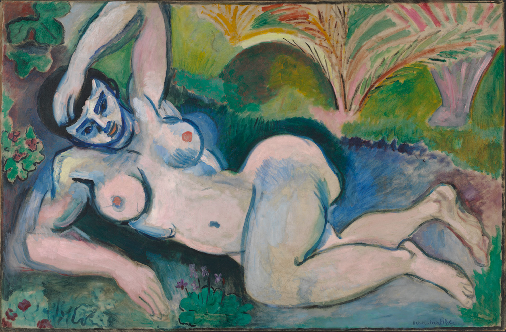
3. Blue Nude by Henri Matisse
This is an example of Expressionism to try and give the symbolic meaning of creating this piece very quickly before the idea can get interrupted.
Analysis on Blue Nude by Henri Matisse
Strong outlines
Arm has moved, but not painted out of the picture
Womans figure is obscure
Contradicts to the pose
Flat background
Woman is painted in a strange shade of blue
Woman is outside in the garden, naked
Connotations of race within the painting
Representation of local women
Setting up the view of mlae gaze
Not illusionistic
Proportions are off
Womans pose is similar to the Venus pose
Primitive form of the naked body
Matisse is trying to fracture the gender stereotypes
Trying to distort the male gaze
Matisse and the Decorative
4. Red Room (Harmony in Red) by Henri Matisse
Analysis on Red Room (Harmony in Red) by Henri Matisse
Clear focus on decorative elements
The pattern is very relevant
Blue decorations on the red wall and table cloth
Decoration continued down the painting to merge at the bottom
Reduces the 3D perspective
Use of flowers, vases and fruit can be seen as decoration
Woman is tending to the fruit
Representing the woman in a servant role
Black outlines
Flat colour/background
Window opens the painting up to a different level
A green garden adds a sense of depth
Is it a painting or an open window to the garden?
The red is very flat and overpowering
The intended purpose
Abstracted
Seem’s to be painted quickly to highlight a honest impression
African Artefacts
5. African Art
A source of inspiration for this art style!
German Expressionist
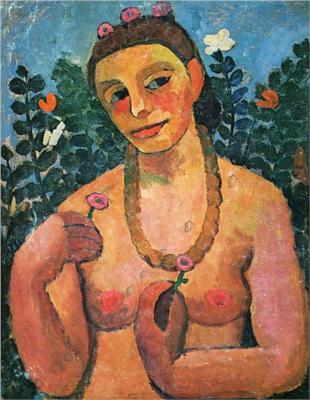
6. Self-Portrait by Paula Modersohn-Becker
German Expressionsim focuses on drawing Primitive from their own culture. Very statuesque painting, and doesn’t summon the view of the male gaze in the same way due to the different framement and the fact it was painted by a woman. It focuses more on the nature and innocence of women.
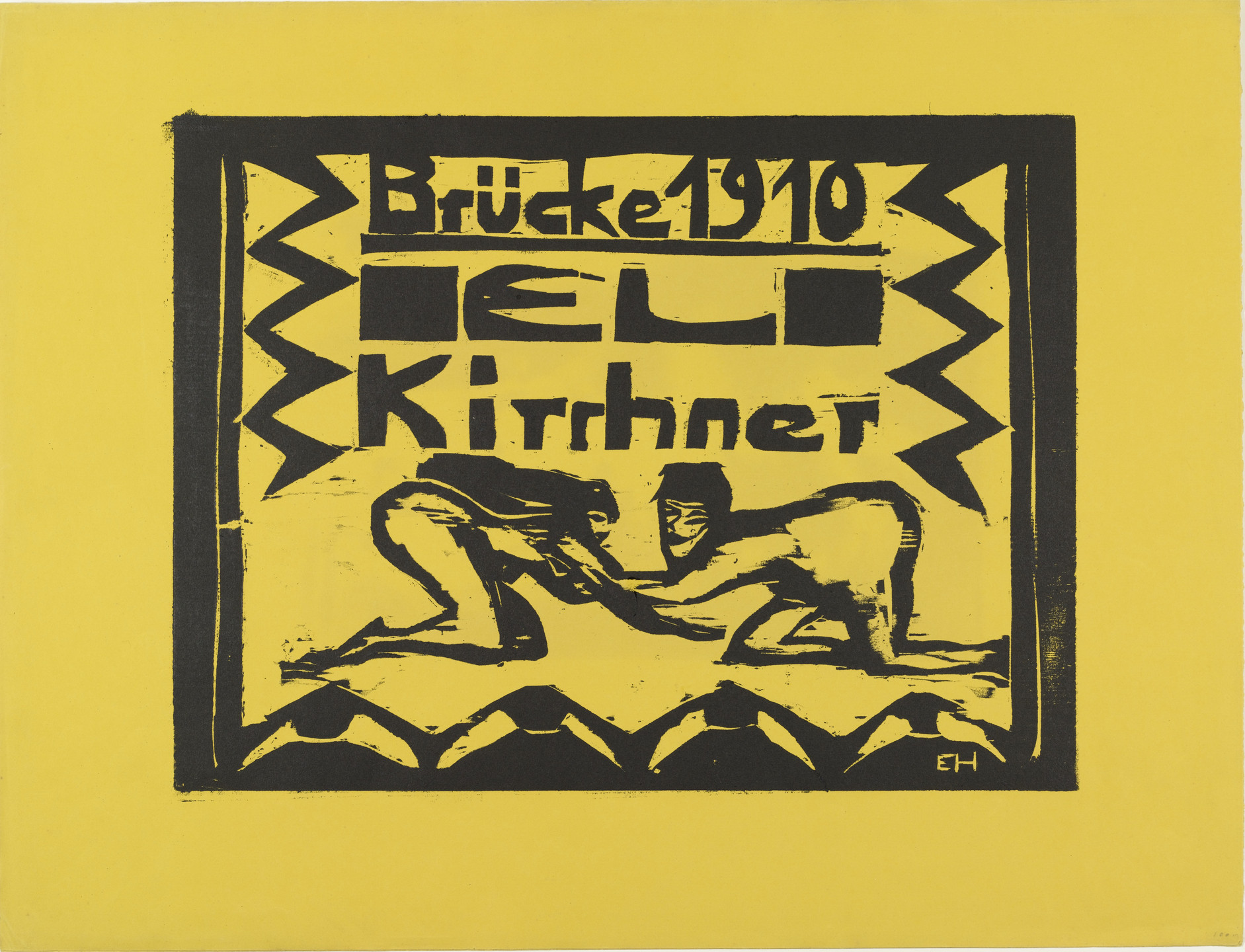
Primitivist Printmaking
7. Brücke 1910 Portfolio by Ernst Ludwig Kirchner with Erich Heckel
Now that all of my illustrative elements have been drawn, I can bring them onto the double page spread and set them within a specific style to convey an infographic. This is something that I am really looking forward too because I want to see my original sketch come to life! But, during this process I soon discovered a few pieces that needed changing and developing, these pieces can be seen below along with the completed infographic piece:
The Hollow Earth Entrance
When I first brought in the Hollow Earth Entrance illustration, the black background worked. It related to the idea of space, but when seen within the finished double page spread, the black was too strong and overpowering. In addition to this, the black background seemed to highlight the idea of a cartoon world view, which is not the intended style for my final piece. So, I changed it. The colour scheme played an important part in this development, I wanted to have a earthy colour that related to the Earth, especially since I couldn’t use blue for the ocean. Because of this, I decided to pick the brown within the colour scheme and filll in the background and the black concentric rings within the centre of the earth. While on paper, this idea seemed solid, in practice it was slightly more difficult because I forgot to work in layers… To change the black to brown, I had to repaint over the black but make sure to leave a black outline so it connects to the other illustrations already drawn. I think the change made is far better than the original, and is a greater fit to the overall syle of my illustration infographic.
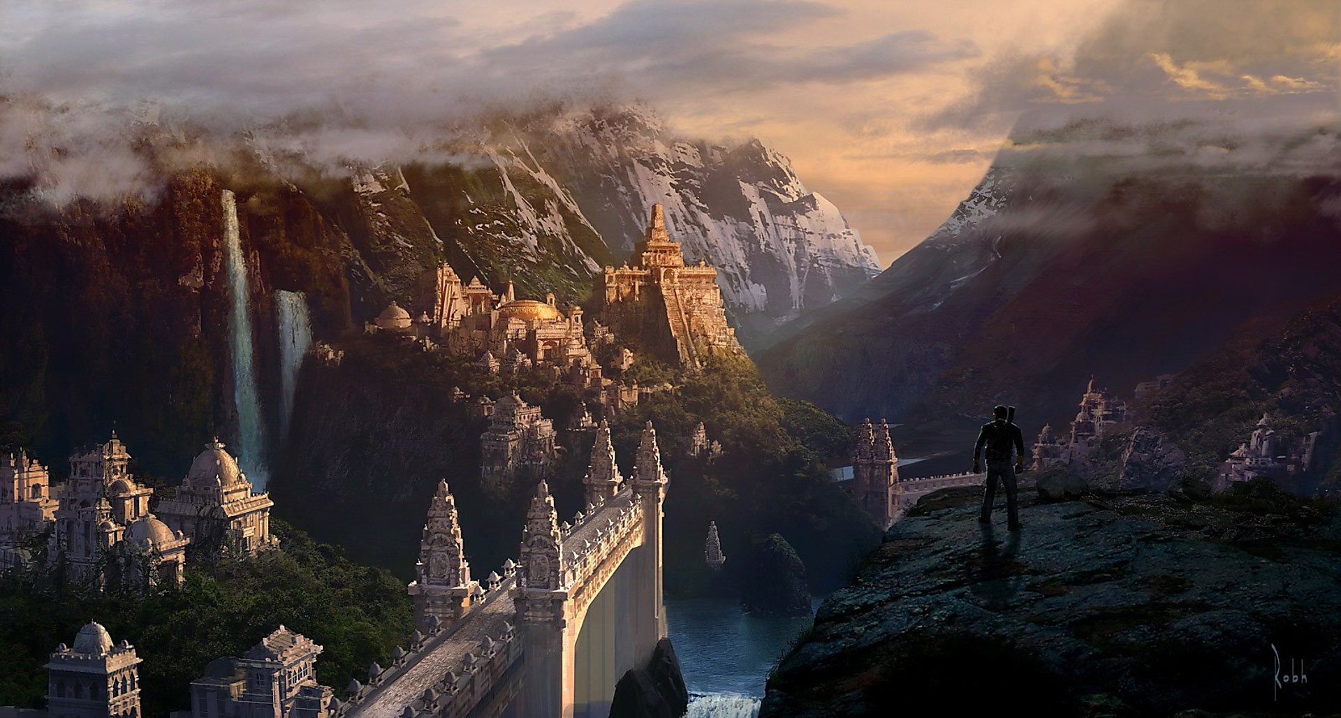
The City of Shambhala
So, I decided to take on the points mentioned by my partner and work them into a developed design. As mentioned before, the small scale of the canvas makes them difficult to see as they become distored, but I think the developed illustration is slightly better to see because the outlines have become stronger an more defined. In addition to this, I added more structural elements – buildings and bridges – to create the impression that there is more city than mountain. The developed piece works much better in the idea that you can easily see it more, and the entire piece has become more dynamic. I think the suggestion made by my partner was perfect, and I was right to follow his directions to create a better final illustration for the City of Shambhala.
Above, I have placed two double page spreads, the first being the starting point of creating the infographic – the first four drawn illustrations can be seen here – it is this half-finished piece that I showed in my Interim Crit presentation. From here, I recieved suggested developments and changes from my peers and tutors, which helped me to create the completed final infographic. All the illustration elements have now been brought together and the infographic is a very strong and dynamic piece, one that I think works really well and will be very eye-catching when set within the square book format. Some of the previous positioning of pieces have been changed, for exmaple I have moved the location point dropper to sit within the mountain scape to better connect with the City of Shambhala illustration, as well as changing the colour from red to green because the red looked out of place, especially since it doesn’t connect to the chosen colour scheme.
The only aspect of this design that I might change is the position of ‘Agartha? The Old Ones…’ which at the minute is quite difficult to read because it is placed over the weather features of the illustration, I think this piece of text would work better if moved to sit within the plain white cloud just above. But this something that can easily be changed at the end of my project, at the minute I want to start focusing on the second illustration infographic!
For my Hollow Earth Conspiracy Plan, I had 6 different illustration elements – the Hollow Earth entrance, torn newspaper cutting, lined paper and the pyramids of giza, the city of Shambhala and the Hollow Earth itself. I wanted to focus on the illustrations first as images alone and later on add the text elements outlined within my planned sketch – allows me to follow the plan of creating each illustration individually and to bring them onto the background as a complete illustration, and also experiment with drop shadows etc. My first 4 illustrations have already been outlned in a previous blog post, for this one, I will be focusing on the last 2 illustrative pieces – City of Shambhala and the Hollow Earth itself. These designs can be seen below with reference images:
City of Shambhala
I struggled quite a lot with this illustration, I was unsure which route of mythical city inspiration I wanted to go down but as well as this, the actual illustration was difficult to complete due to the small size guide of the canvas – which was created on Adobe Fresco. The illustration above is not given justice because to see the piece clearly, it has to be enlarged which distorts the drawn lines. However, I have already checked with the proportions of my double page spread that the city is much less distorted when in its actual size. But I still thought something was missing. I showed this illustration to my partner, and he said that the illustration was showing more rock than city and I needed to add more buildings and bridges to convey a greater view of a civilization living in the Hollow Earth. I decided to sleep on the idea, and potentially develop it further at a later date. I have placed my reference images below to show how I created the illustration above:
1. Mythical City
2. Mythical City
3. Mythical City
Hollow Earth
This illustration is the important one for the final piece, it is meant to highlight the idea that there is a lost city and entire world under our own Earth. For this piece, I completed the illustration on Adobe Fresco, and worked in many different layers to ensure that the final illustration was easy to change and edit if needed. Because of all the other illustrations that would surround this piece, I wanted to make sure that the inside of the Hollow Earth was detailed and easy to understand while also not being overly busy when added to the final design. Due to this, I made sure to follow my original sketch, which showed a simple representation of mountains, fauna and weather and I made the decision to the follow the same representation within the ilustration but in a more detailed and finalised way. Overall, I think this piece worked really well, and the last step for this piece is to surround it with the other illustrations! Hopefully it works well and doesn’t look overcrowded and cluttered in a negative way – I want busy in a fun, engaging and informative way! I have placed my reference images below to show how I created the illustration above:
4. Hollow Earth
5. World Map with Landmarks
6. Collection of Leaves
Overall, I think my current designs work quite well as individual pieces. The only one I am unsure about is the City of Shambhala, taking on the advice given to me by my partner, I think I need to spend some time defining the outlines of thse buildings so they are easily seen, and add a few more structural elements to highlight the intention of a living civilization under our Earth. So far, I think the design is coming together really well, and could potentially create a very strong and dynamic infographic. The next step is to bring all the piece together and add the infographic elements, like text and arrows etc.
Sources
Pinterest. 2020. Vivacious And Wonderful Village Art For Your Wonderment – Bored Art | Fantasy art landscapes, Fantasy illustration, Fantasy artwork. [ONLINE] Available at: https://www.pinterest.co.uk/pin/675328906604285103/. [Accessed 26 November 2020].
Pinterest. 2020. Plant Identification | Tree leaf identification, Leaf identification, Tree identification. [ONLINE] Available at: https://www.pinterest.co.uk/pin/819725569663916996/. [Accessed 26 November 2020].
Following on from my Interim Crit notes I wanted to start the suggested developments now while they are at the front of my mind. In this case, I wanted to focus on re-working the torn newspaper cutting, finding a different font for the complete piece and coming up with an idea for how the additional information should be presented in the final piece. My developments and thought process can be seen below:
Torn Newspaper Cutting
The first development I wanted to tackle was the aesthetic of the torn newspaper effect. I thought this rework would be really difficult, especially since I had no idea on how to make a realistic torn newspaper effect – this is when I turned to Youtube to help:
Photoshop Tutorial: How to make torn or ripped paper effect from scratch
By using Youtube, I was able to find a instructional video on how to create a torn or ripped paper effect from scratch. One big change that I had to incorporate within my rework was swapping the Adobe Software, for the original illustration I used Adobe Illustrator, but the tutorial explained the process of creating this effect by using Adobe Photoshop. I found this tutorial really helpful and easy to follow, and from the end of the process I ended up with a torn/ripped paper effect that looked realistic and worked well with the intention of turning it into a newspaper aesthetic. My development can be soon below:
While the tutorial was easy to follow, I struggled with how the torn paper should look. When I created the original torn newspaper cutting, I included a headline, section of the article and an image but I thought it was too much, and I knew in my development that I wanted to have either the headline or headline and article, the image had to go because it made the original piece look too cluttered. The next step was to decide on how torn paper should look, from here I came up with 3 different potential developments that could be used in the final design:
Development 1
Headline is torn from the middle of the newspaper, causing a ripped/torn effect on the top and bottom of the design
The edges are straight to imply the edge of the newspaper
Small section of the article is seen beneath the headline
Development 2
Headline is torn from the top of the newspaper, causing a ripped/torn effect at the bottom on the design
The edges and top section of the design are straight to imply the edge o the newspaper
This design only holds the article headline
Development 3
Headline is torn out of the newspaper in a diagonal format, causing a ripped/torn effect on the diagonal tear of the design
The other three edges are straight to imply the edge of the newspaper
Large section of the article can be seen beneath the headline
From the first development attempt I used the font ‘Franklin Gothic Medium’ for the headline, but I soon decided that the headline looked too bold and overbearing for such a small torn out area. From here, my next two developments used the font ‘Courier New’ which I think links better to the idea of a newspaper aesthetic. With the three different options available to me, I decided to use the third development attempt because it was the most similar design to the original, so I thought that this style of torn paper would fit best within the allocated space in the conspiracy theory spread design.
Changing the font
Due to my subscription to the Adobe Cloud, I have access to the Adobe Fonts which is a really useful and helpful font finder that can be activated on all owned Adobe Software. With the help of Adobe Fonts sections, I looked through the section called ‘Handwriting’ and found a font called ‘Chantal Medium’ which conveys the same fun and engaging element that I need and want for the final spread, but in a bolder and stronger typeface. The only possible downside to this font is the how it doesn’t include a lowercase alphabet that can be used, everything written in this font is seen as uppercase only – this is something that I personally prefer because it relates more to my personality because I also write only in uppercase. But some could say that the consistent uppercase is too overbearing, maybe implying a more shouty tone…however, this is a design choice that I have decided to keep within the double page spread.
Ideas for the additional information pages
Because the composition for my already designed pages work so well, I want to make sure that I keep them as they are and instead add 3 new double page spreads that hold the information for the conspiracy theories. The plan I have in my head is to rotate the pages as infomation page, illustration page, information page and so on. I’m hoping by doing this rotation, the busy illustration pages will become a more engaging element within the book, because the information pages (which will be far more simple) will break up the constant busy-ness represented.
For the information pages, I have an idea in mind that uses a double page spread format. In this case, the left hand page will hold a quote about the conspiracy theory, while the right hand page will hold the title of the conspiracy theory and a small write up that offers information about that theory which the audience can use as a guide to help them understand the illustration on the next page. This idea is only in my head, and won’t come to life until all three of my illustrations are complete and ready to become a book format within Adobe InDesign. This could mean that the overall idea, could change but they won’t differ much from what I have written above.
Because we are over halfway through project timeline, we were expeced to create a Pecha Kucha for our design process so far in the project. In this case, I have a powerpoint presentation of 13 slides, all set at 20 seconds with examples of my research so far, ideas so far and designs so far. My designs are not yet finished, but they are coming along very well – hopefully this can be seen in the presentation. I have placed a screen recording of the Pecha Kuch below:
Conspiracy Theory Interim Crit Presentation – Screen Recording
The overall response from my presentation was positive, I was creditied on my level of research, my use of persona cards and mood boards and how I used these to help inspire my final idea – who am I aiming my design for and what colour scheme I will be using throughout the illustrative process. In addition to this, the original sketches for the double page spread layout were taken really well as well as my process of digitalising them. As for my actual illustrations, I recieved good comments on them all. It was mentioned that my illustration style was well supported with research and analysis and they all seem to work together on the actual page.
Ofcourse, all Interim Crits come with suggested developments. And I took mine on board because I also agreed with everything Tim and Sancha said. It was mentioned that my torn newspaper cutting needed some rework because it looked out of place due to the pointed edges, on a sketch it was clear what the element was, but the digital illustration doesn’t look realistic and sits strangely with the other already illustrated elements. It was suggested that I rework it into a more realistic torn newspaper cutting.
Another point that was suggested to change by Tim and Sancha was they type I had currently on the design. At the minute I am using a font called ‘Ink Free’ which I chose because it coveyed a handwriting style, a key element I wanted to focus on so it connected more to the overall inspiration of a police evidence board. The style of the font wasn’t the issue in Tim and Sancha’s suggested development, they agreed that the use of handwriting conveyed a more fun and engaging element to the overall design. What they did say, was the typeface was too thin and feint, it didn’t stand out enough to become engaging – they instead suggested to use a bolder and stronger typeface to insure that the type can be easily read on top of the illustrations.
One thing that was mentioned, which wasn’t really a development or a rework, but more of warning or caution was the guttering down the centre of the page. At the minute, the design is very flat and I completely forgot about how the centre of the design would look if situated within a actual book (like a mock up). The gutter in the centre of the page would cave in, bringing in any of the elements that sit on or over the middle crease. It was mentioned that I needed to be careful of my positioning for the text to ensure that the type would not be lost within the fold of the book.
Lastly, as I explained my original sketches for the final pieces, I was asked how I was planning on explaining these pages within the book. It was sugessted that as my designs hold a collection of information and facts, I need an additional design piece that explains and ties the conspiracy theories up for the audience to understand. This could either be done in a blurb, small write up or any other way that I think would be suitable and fit the design. At the minute, I don’t have any ideas on how this small write up could be presented, but I know that if I spend some time thinking about it, I will soon arrive at a suitable idea!
Overall, I think my Interim Crit went quite well. Everything I presented was taken on board and the suggested developments were aspects that I also agreed needed changing or reworked. What I need to do now, is implement these suggested developments and finish the final two illustrations to complete the first piece.
For my Hollow Earth Conspiracy Plan, I had 6 different illustration elements – the Hollow Earth entrance, torn newspaper cutting, lined paper and the pyramids of giza, the city of Shambhala and the Hollow Earth itself. I wanted to focus on the illustrations first as images alone and later on add the text elements outlined within my planned sketch – allows me to follow the plan of creating each illustration individually and to bring them onto the background as a complete illustration, and also experiment with drop shadows etc. My first 4 illustrations can be seen below:
The Hollow Earth Entrance
This was my first illustration for the piece, I decided to focus on different representations of how the entrance to the Hollow Earth has been believed to look like (I have included the images below as a reference) and use the images as inspiration for my own piece. The illustration itself was made on Adobe Fresco and made on one layer – which will probably prove to be a mistake later on I chose Fresco because it is the better software for painting, in my opinion and holds the best chance of me being able to create a suitable illustration for this piece. Creating the outline for this illustration was relatively easy, it was the colour scheme that I had difficulty including successfully, I was unsure which colour should sit where but I was certain I wanted the colour green to be a key element within the earth section of the piece.
1. Entrance to the Hollow Earth
2. Entrance to the Hollow Earth
Torn Newspaper Cutting
This illustration was based on the original sketch I created for the plan. I wanted to convey a torn newspaper effect to highlight the potential idea that Hitler escaped into the Hollow Earth but with a more scientifical essence to the overall piece. The illustration itself was created on Adobe Illustrator and I struggled throughout the process of making it. The size for this piece, follows the outline of the rectangle drawn over the original sketch, but the actual creation was complicated. I used the pen tool to create a line of spikes across the side of the paper and situated the text within inside the drawn pattern. I was trying to create the illusion of a newspaper article, but I think the overall style is too cartoonish, which ultimately draws the essence of real evidence away from the illustration…this may have to be an illustration that I develop.
Lined Paper
This illustration was the simpliest to make. Much like the torn newspaper effect I used the same size guide from the drawn outline over the sketch. From here, I created a series of lines to imply the impression of a lined paper but to incorporate it more within the colour scheme, I changed the regular black lines to colour within the scheme – the horizontal lines are a grey and the vertical line are brown, as for the background, I wanted to reduce the brightness offered from the white and change it for a light grey to insure that the lined paper doesn’t steal focus from the other illustrations.
Pyramids of Giza
This illustration followed the route of isometric design, and I created this piece within Adobe Illustrator using an isometric grid pattern to help determine how the pyramid should be situated to create the impression of a 3D effect. The overall process to create this piece was quite simple, I used the pen tool and followed the lines outlined in the isometric grid to create the impression of 6 different size pyramids. The illustration is set within a polaroid and even though it is simple, I think it clearly conveys the impression of the Pyramids of Giza. To create this piece, I followed an image of the Pyramids of Giza as a reference guide – which can be seen below. As for the colour scheme, I followed the idea of 3D perspective and used different shades within the scheme to determine a clear image of a 3D based pyramids.
3. Pyramids of Giza
Overall, I think my current designs work quite well as individual pieces. The only one I am not sure on is the newspaper cutting, I think it conveys a more child-like, cartoon representation which is not the style I am intending to go for – I think I need to rethink the appearance of the newspaper to hold a more realistic style. The next step from here is to bring these individual design elements together for the complete piece, as well as illustrate the last two elements! I think this Conspiracy Theory idea is slowly coming together!


