Categories
Commemorative Stamps Illustration Options

Sizes of Stamps

Trying to find the size of stamps is a real task, and Google is less than helpful! Google will instead of offering the measurements of a stamp, will offer the size guidelines of what size letter goes with what stamp. But with enough searching, you can sometimes stumble across a silver lining!

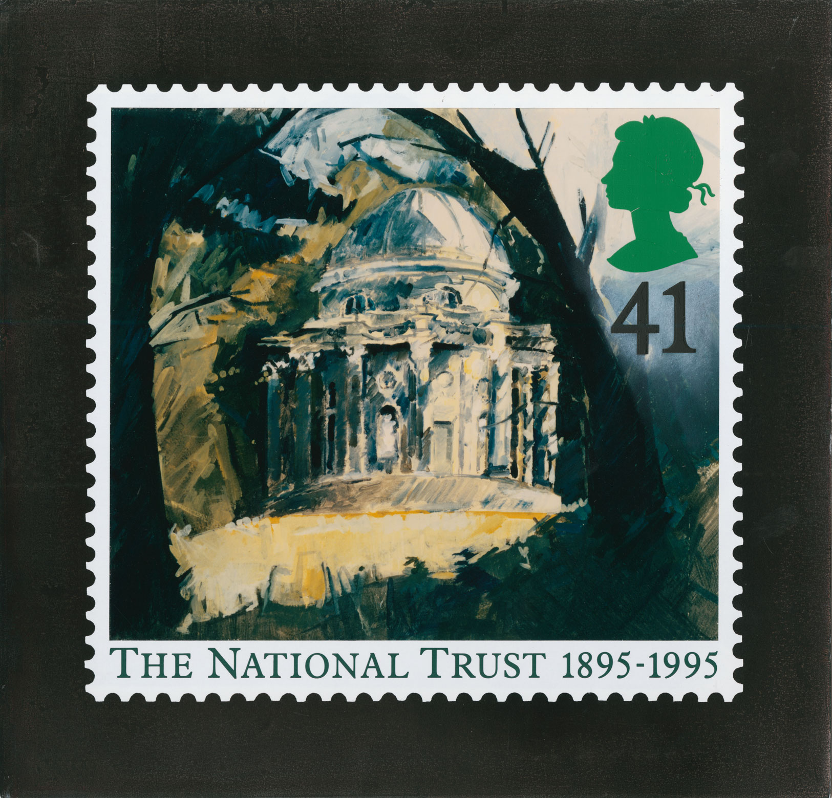
I wanted to start simple, and list the things that I already knew about stamps. From my understanding, there are two 1st class stamp sizes – square and portrait/landscape. The portrait/landscape stamps are seen to also be referred to as a ‘large’ stamp, where as the square is seen to the classic stamp shape. In addition to this, each step is seen to have a perforated edge which surrounds the entire stamp design. One of the key elements of any stamp is the Queens head, on a original red stamp, the Queens head is the centre piece of the stamp, but when you start to look at commemorative stamps that have a different design, the Queens head is normally repositioned in the corner of the stamp, also slightly scaled down. But the Queens head is a key element that must be included! I have placed the two original stamp sizes below:

Royal Mail Increases Price Of First Class Stamps | Mintage World
1. First Class Stamp
Royal Mail Large 1st Class Stamps x 50 | Staples®
2. First Class Stamp

Now here’s the silver lining I was talking about! I managed to find a PDF document that focused on the user guide for a unsorted account barcode. I’m not 100% sure if this is a accurate stamp measurement, but it is the closest measurement I can find. What I think I have found is the Royal Mail barcode label that is printed onto certain envelopes and parcel, but this label does hold the measurements of where the stamp would normally reside.

Account Barcode Unsorted
3. Square Stamp Measurement : 17mm 18mm
Account Barcode Unsorted Guide - April 2019 V1
3. Portrait Stamp Measurement : 17mm x 21mm

When trying to find the measurements of a stamp, I was also involved in a conversation with some of my other classmates and a peer of mine had found some unused 1st class stamps at home, which they very kindly measured and sent to our group chat:

  • White edge of the stamp = 1mm
  • Width without border = 18mm
  • Height without border = 21mm

The measurements told to me by my classmate seems to be very similar to the portrait stamp measurment seen above. Which makes me think the information I discovered on the Royal Mail PDF is accurate!

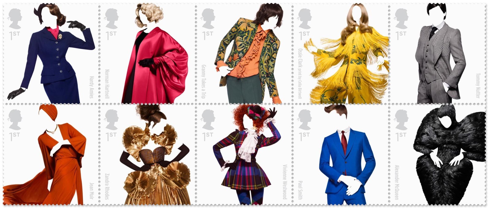
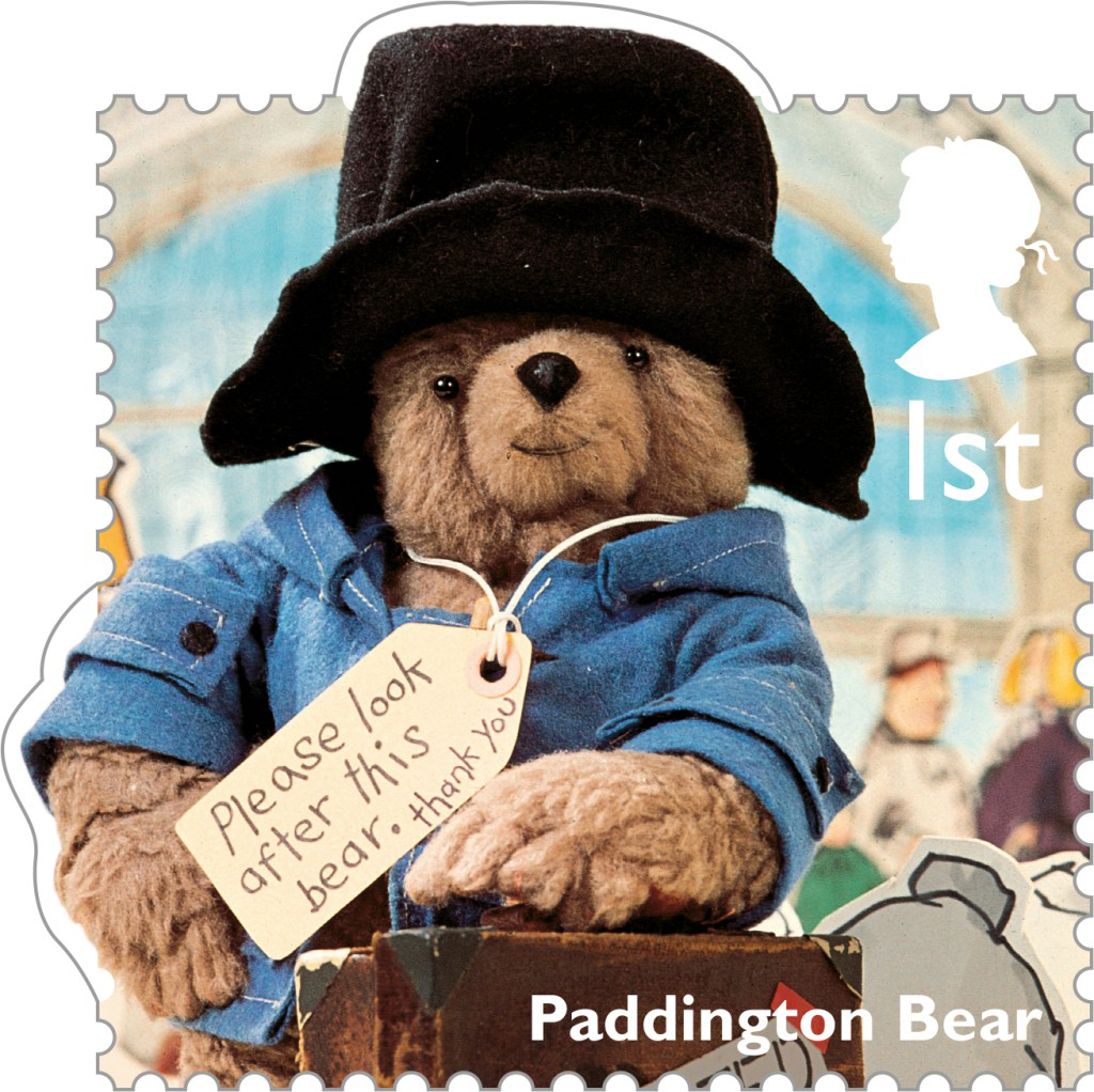
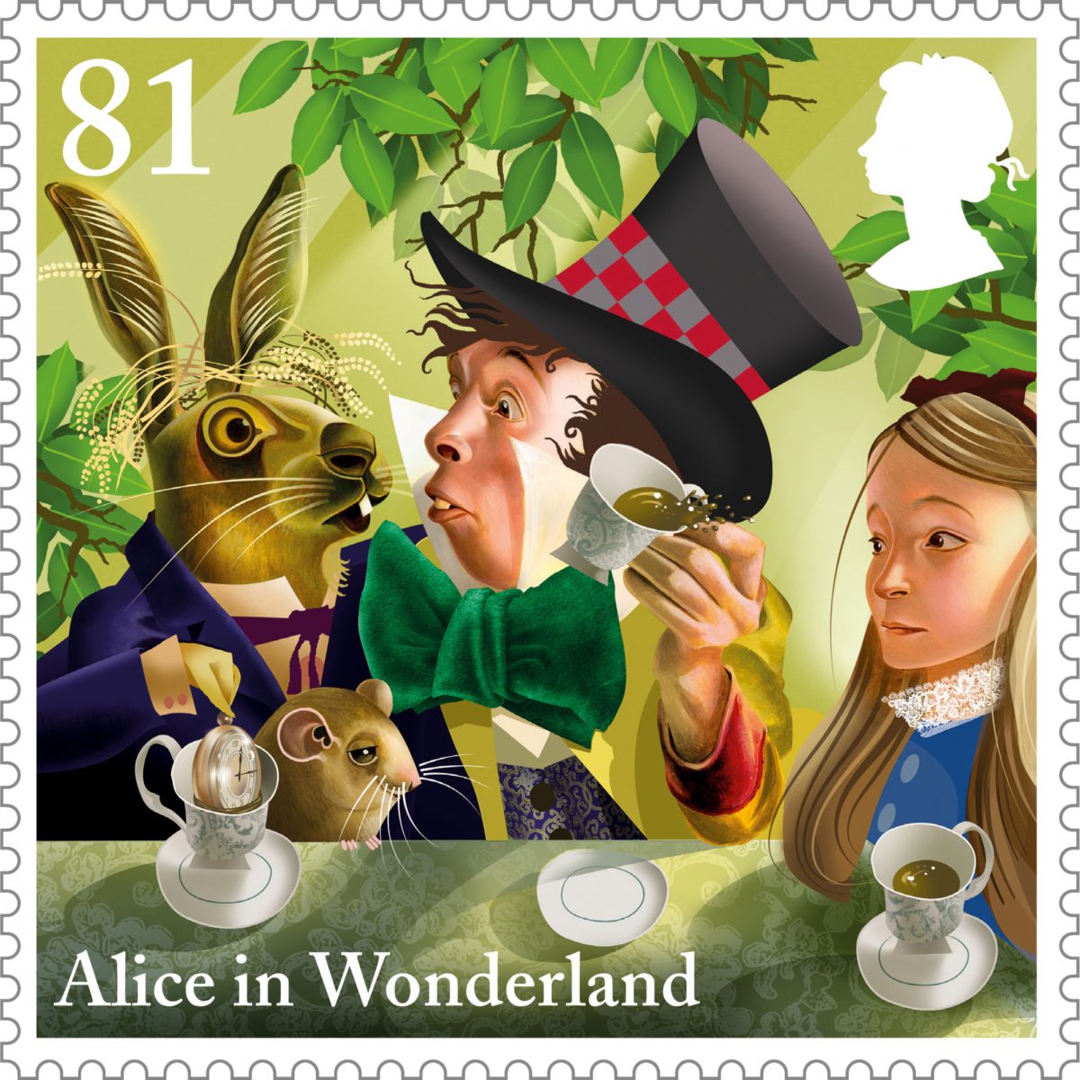
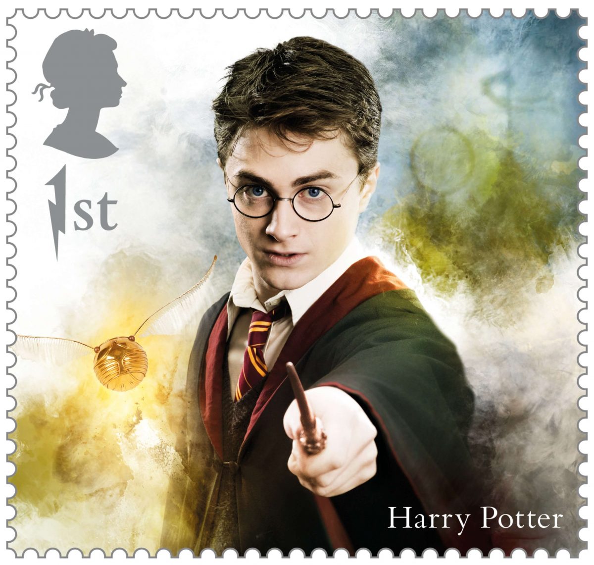
As mentioned above, the Queens mark must be included on any and every stamp, but the size and scale of this element is still unknown. In addition to this, I have also seen two variations of the Queen’s mark on stamps, and I am unsure which one to use for my own project. At the minute, I am thinking either one of the steps will work because they are both clearly the Queen, one is prehaps a more modern version. Not only this, but it seems to relate to the stamp design. If you are using a classic red stamp, than it is more than likely that you will have the Queens head to fill the space of the stamp, and the mark for this is the more modern take on the Queen’s mark (Ref 4). If you are using a commemorative stamp with a unique design or illustration on it, it is more than likely you will have the classic Queen’s head mark, which seems to focus on the silhouette of the queen without any jewels or crowns (Ref 5).

Anyway, back to the size of the Queen’s mark on a stamp, I still don’t know, I think this is an aspect of the design that will need to be played by eye. The Queen’s mark seems to normally sit in either of the top corners of the stamp, with the ‘1st’ either next to or underneath. The scale of this mark is very important in terms of the stamp size, it is imperitive that the mark, along with the stamp design, is clearly visible at a small scale. And the design of the stamp cannot take presidence over the Queen’s mark, I think this is all about a level of balance, one that allows the design of the stamp to be noticable along with the Queen’s mark. And depending on the overall size of the stamp, will help to scale the Queen’s mark effectively.

Pin on Stamp design

4. Queen’s Head for a stamp
Design Practice: STAMP IT!// Queen's Head
5.

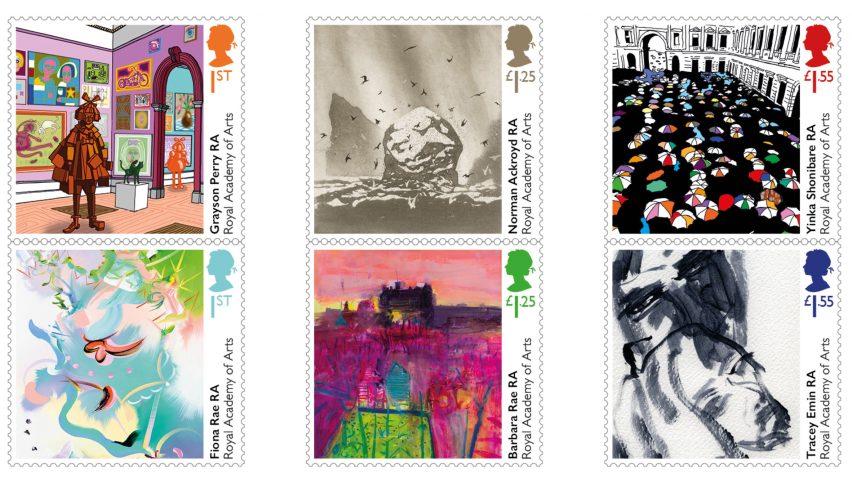
With the difficult stamp measurements over, I wanted to take a look at a stamp scale that I am interested in using for my own designs. At the minute, I am leaning towards a rectangular landscape stamp, but the measurements mentioned above do not seem to connect with the stamp collection seen below:

6. James Bond Commemorative Stamps

The James Bond Commemorative Stamps, seem to be slightly longer than the measured 21mm. But I do have a gut instinct that this scale and size of stamp would greatly support my building theme because it offers a greater surface area to experiment with. I think in this case, I need to practive with possible stamp sizes and scales, and hopefully find something that resembles the stamp set shown above…


Sources

  1. Mintageworld. 2020. Royal Mail increases price stamps. [ONLINE] Available at: https://www.mintageworld.com/media/detail/863-royal-mail-increases-price-stamps/. [Accessed 5 December 2020].
  2. Staples. 2020. Royal mail large 1st class stamps. [ONLINE] Available at: https://www.staples.co.uk/royal-mail-large-1st-class-stamps-x-50/cbs/297797047.html. [Accessed 5 December 2020].
  3. Royal Mail. 2020. Account Barcode Unsorted User Guide. [ONLINE ] Available at: https://www.royalmail.com/sites/default/files/Account-Barcode-Unsorted-User-Guide-March2017_0.pdf. [Accessed 05 December 2020].
  4. Pinterest. 2020. Pin on Stamp design. [ONLINE] Available at: https://www.pinterest.co.uk/pin/533817362056038095/. [Accessed 05 December 2020].
  5. Design Practice: STAMP IT!// Queen’s Head. 2020. Design Practice: STAMP IT!// Queen’s Head. [ONLINE] Available at: http://s-isles1114-dp.blogspot.com/2012/03/stamp-it-queens-head.html. [Accessed 05 December 2020].
  6. Royal Mail reveals commemorative James Bond stamps. 2020. Design Week. [ONLINE] Available at: https://www.designweek.co.uk/issues/15-21-june-2020/royal-mail-reveals-commemorative-james-bond-stamps/. [Accessed 5 December 2020].
Categories
Commemorative Stamps Illustration Options

Researching Commemorative Stamp Designs

Using the briefs Indicative texts and other sources section, I was able to quickly find a selection of previously designed commemorative stamps to research. I wanted to look into a varied level of different designed stamps, but also include stamps that will somehow relate to my theme/idea – which is why I have tried to include a few different stamps that focus on buildings. My research can be seen below:

https://www.johnsonbanks.co.uk/work/stamps

Great British Fashion, 2012

This stamp collection focuses on the 60 years of fashion history, which was inspired by the stamps that featured Mary Quant’s mini-dress. The main challenge with this subject matter was how to present the clothes in a an interesting way and have no one wear them. It was decided that the stamps needed to highlight the fashion without the use of celebrities and models to distract the audience away from the clothes. The compromise for the this stamp shoot focuses on the clothes being modelled on real people, but digitally removing the faces and hands. Once the photoshoot was completed, they started to digtally retouch the image and bring out the lines, textures and movement of the garments. The stamp themselves celebrated the work of Hardy Amies, Norman Hartnell, Vivienne Westwood and Alexander McQueen.

The Beatles, 2006

For this stamp collection, Johnson Banks was supposed to explore the merchandise that surrounded the band. Which they did, but were always drawn back to the iconic designs used on the album covers. Their first idea was to photograph the album covers on a background that was very 60s inspired, but this soon developed into focusing on the album covers alone. Banks soon discovered that the irregular sets of alum covers worked stacked on top of each other, and they were able to persuade the Royal Mail that the asymmetric, irregular edges could be perforated aswell. The only difficult part of this project was the design process for the perforated edges.

Fun Fruit and Veg, 2003

This project was inspired by a series of designs in the 1990s that were a bit ahead of their times and shelved away. When the brief returned up for a set of ‘interactive’ stamps loosely aimed at children, Banks knew where to turn. It was suggested to the Royal Mail to focus on ten nicely photographed fruit and vegetable stamps, accompanied with 72 stickers. The idea focused on how the audience could create their own vegetable faces.

https://www.postalmuseum.org/

National Trust Stamps : David Gentlemen

Stamp depicting a castle surrounded by trees and bushes.

This stamp series were produced with a soft watercolour look that focused on key landmarks from different areas. The design above, which is the 35p stamp, focuses on a illustrative take on the medieval Powis Castle situated in the Welsh county, Powys.

National Trust Stamps : Eileen Hogan

41p stamp that depicts a painting of the temple in the ground of Stourhead with caption and perforation surround.

This stamp series focused on a abstract painting aesthetic formed of strong bold lines emphasising the dominace of the buildings with their landscape. The 41p stamp shown above is a painting that depicts the Temple of Apollo at Stourhead.

The Tale of Peter Rabbit, Beatrix Potter

All of the stamps shown above are linked to the theme of Childrens Books, sepcifically a series of books that have a focus in letter writing within the story:

‘I don’t know what to write about so I shall tell you a story of 4 little rabbits, whose names were Flopsy, Mopsy, Cottontail and Peter…’

Love from Paddington, Michael Bond

Dear Aunt Lucy,
I expect this will come as a great surprise to you, but not only have I arrived in England, but I have an address! I’m staying at number 32 Windsor Gardens and it isn’t at all like the Home for Retired Bears…

Alice’s Adventure in Wonderland, Lewis Carroll

`I haven’t opened it yet,’ said the White Rabbit, `but it seems to be a letter, written by the prisoner to–to somebody.’

`It must have been that,’ said the King, `unless it was written to nobody, which isn’t usual, you know.’

`Who is it directed to?’ said one of the jurymen.

`It isn’t directed at all,’ said the White Rabbit; `in fact, there’s nothing written on the outside.’ He unfolded the paper as he spoke, and added `It isn’t a letter, after all: it’s a set of verses.’

Harry Potter, J.K. Rowling

“We are pleased to inform you that you have been accepted at Hogwarts School of Witchcraft and Wizardry. Please find enclosed a list of all necessary books and equipment. Term begins on 1 September. We await your owl by no later than 31 July.”

https://www.dezeen.com/tag/stamps/

Royal Academy’s 250th anniversary

Grayson Perry and Tracey Emin mark Royal Academy's 250th anniversary with bespoke stamp designs

For this series of stamps, the Royal Mail commisioned six artists to create bespoke stamps to celebrate 250 years since the Royal Academy was founded. Each artist’s stamp is designed to be a reflection on their won work, and the RA’s annual Summer Exhibition. This stamp collection has been called a ‘wonderful miniature works of art.’ If I had to pick a favourite stamp from the collection above, it would have to be Yinka Shonibare’s stamps (top right hand corner) which is called Queuing at the RA and features a number of colourful umbrella tops dottedd across the gallery’s Burlington House courtyard entrance.

Renaissance of contemporary architecture

Landmark building stamps

This series of stamps are dedicated to the the contemporary architecture in the UK. Designed by London design agency GBH focus on 10 of the most famous public buildings from the last two decades. The buildings include London Aquatics Centre; Library of Birmingham; SEC Armadillo, Glasgow; Scottish Parliament, Edinburgh; Giants’ Causeway Visitor Centre, Northern Ireland; National Assembly for Wales, Cardiff; Eden Project, St Austell; Everyman Theatre, Liverpool; Imperial War Museum North, Manchester and the Blavatnik Building (formerly Switch House), Tate Modern, London. Each photograph was carefully planned to ensure that the photographer could achieve the perfect shot of the building, when completing this project, the style of a square stamp was always in their mind, and they had to retake many of the photographs until they got the desired image.

Royal Mail’s Animal Stamp Collection

Animail stamp range for the Royal Mail designed by Osbourne Ross

For this series of stamp, the London design studio Osborne Ross was asked to create a series of 6 animale shaped Royal Mail Stamps, specifically used to appeal to children. Each of the creatures designed appears to hang or cling onto the envelope, making the desing far more engaging for children. Each illustration of an animal was shown to the Royal Mail and reworked to fit in with their technical requirements, which dictate where the stamp can appear on an envelope and what colours can be used.

Because I have looked at a various collection of stamps, I have a limited idea on what should be included within the design. Nearly every stamp shown above differs in someway, but the overall theme of them all is to engage the audience and celebrate their designed topic. Stamps can be as simple or as complex as the artists wants to make them, but also long as they are easily visible and understandable at a small scale, then they are effective as a stamp design. It seems to me that almost anything can be done when designing a stamp as long as the size and scale is kept in mind. This is a key element I need to remember when illustrating my chosen pubs and restaurants. As well as, colour and positioning of course, but this can be done in the initial sketching process.

Categories
Commemorative Stamps Illustration Options

What Pubs and Restaurants do I want to focus on for the Stamps?

Before I start any illustration work I wanted to create a list of possible pubs and restaurants I could focus on. While trying to put together this list, I soon realised that I could use this project for more than just stamps and potentially create illustrations of the buildings listed below, and gift them to the owners as a celebratory token of the hardship they have all endured throughout the two lockdowns and Tier systems. Because of this idea, I will need to illustrate these pubs at a larger scale than a stamp, which means the stamps could follow the previous mentioned idea of holding a small illustrated area of the building, however, this is not set in stone, I still plan to illustrate different ideas for the stamp designs and decide from there. My list of possible pubs and restaurants can be seen below:

Possible Pubs

Grove Tavern

The Grove Tavern (Royal Tunbridge Wells) - 2020 All You Need to Know Before  You Go (with Photos) - Royal Tunbridge Wells, England | Tripadvisor
1. Grove Tavern

Pantiles Tap

PubsAndBeer.co.uk - The Pantiles Tap, Tunbridge Wells, Kent
2. Pantiles Tap

Duke of York

Duke of York, Tunbridge Wells • whatpub.com
3. Duke of York

The Gallipot Inn

Genius pub landlord doubles his takings by changing one thing - Mirror  Online
4. The Gallipot Inn

Possible Restaurants

Thackerays

Restaurant Tunbridge Wells - Kent - Thackeray's Restaurant
5. Thackerays

Delaneys

Waffle or Pancake with Milkshake - Delaney's Kitchen and Bar | Groupon
6. Delaneys
THE OLD FISHMARKET BY SANKEY'S, Royal Tunbridge Wells - Updated 2020  Restaurant Reviews, Menu & Prices - Tripadvisor
7. Sankeys

When I mentioned the idea of creating stamps for the hospitality trade and my idea of including both pubs and restaurants, Sancha suggested the idea of narrowing the focus done to pubs alone, and possibly calling the commemorative stamps ‘Kentish Pubs’. This was suggested because Royal Mail are potentially more likely to focus on the pubs as a key interest for the public, but I don’t just want to focus on the pubs. During the Covid-19 pandemic, restaurants have also struggled just as much as pubs, which is why I want my stamps to act as a celebratory token for all hospitality trades in and aorund the surrounding area of Kent.

I am also aware that the brief states that we must produce 2 – 4 stamp designs and I have a list above that holds 6 different buildings. My aim for this project is to produce more than 2, I am hoping to produce stamps for all 6 buildings but if I run out of time, I will make sure that there are at least a showcase of Pubs and Restaurants – either 1 of each or 2 of each. Eventhough the brief’s highest stamp design number is 4, I know a student in the year above who offered 6 stamps for this project last year, so I do think that offering 6 different designs will be acceptable, if they are producded to a high standard.


Sources

  1. Tripadvisor. 2020. The Grove Tavern (Royal Tunbridge Wells) – 2020 All You Need to Know Before You Go (with Photos) – Royal Tunbridge Wells, England | Tripadvisor. [ONLINE] Available at: https://www.tripadvisor.co.uk/Attraction_Review-g186315-d12594790-Reviews-The_Grove_Tavern-Royal_Tunbridge_Wells_Kent_England.html. [Accessed 05 December 2020].
  2. PubsAndBeer.co.uk – The Pantiles Tap, Tunbridge Wells, Kent. 2020. PubsAndBeer.co.uk – The Pantiles Tap, Tunbridge Wells, Kent. [ONLINE] Available at: https://pubsandbeer.co.uk/index.php?ID=P&pub=5846. [Accessed 05 December 2020].
  3. Duke of York, Tunbridge Wells • whatpub.com. 2020. Duke of York, Tunbridge Wells • whatpub.com. [ONLINE] Available at: https://whatpub.com/pubs/TTW/191/duke-of-york-tunbridge-wells. [Accessed 05 December 2020].
  4. Mirror. 2020. Genius pub landlord doubles takings. [ONLINE] Available at: https://www.mirror.co.uk/news/uk-news/genius-pub-landlord-doubles-takings-6042463. [Accessed 5 December 2020].
  5. Thackeray’s Restaurant. 2020. Restaurant Tunbridge Wells – Kent – Thackeray’s Restaurant. [ONLINE] Available at: https://www.thackerays-restaurant.co.uk/. [Accessed 05 December 2020].
  6. Groupon. 2020. Delaneys pancake and waffle kitchen. [ONLINE] Available at: https://www.groupon.co.uk/deals/delaneys-pancake-and-waffle-kitchen. [Accessed 5 December 2020].
  7. Tripadvisor. 2020. THE OLD FISHMARKET BY SANKEY’S, Royal Tunbridge Wells – Updated 2020 Restaurant Reviews, Menu & Prices – Tripadvisor. [ONLINE] Available at: https://www.tripadvisor.co.uk/Restaurant_Review-g186315-d4875492-Reviews-The_Old_Fishmarket_by_Sankey_s-Royal_Tunbridge_Wells_Kent_England.html. [Accessed 05 December 2020].
Categories
Commemorative Stamps Illustration Options

Commemorative Stamps : Choosing a Theme

We were set this brief on Friday November 27th, which gave us 2 weeks for the project to be completed in – has to be handed in on Friday 11th December alongside Conspiracy Theories. However, I was unable to start as soon as the brief was set because I still had my illustrations to complete for Conspiracy Theories. But, as I have now finished this part of the project, I am able to start fresh with the new brief under the same topic as Options!

It is stated within the brief, that we have free choice on what our theme for the stamps can be. The only requirements from the stamps is to make sure we are celebrating an idea, concept, object, piece of history or anything at all that would:

  • a) Reasonably be featured on a UK stamp
  • b) Is relevant to the kinds of images that you’d like to include in your portfolio
  • c) Can be made clearly and to an appropriate standard

And this decision about the theme must be decided quickly!

When the brief was first set, I initally went for the idea of Disney Commemorative Stamps because the year 2021 is the 50th Anniversary of the Walt Disney Resorts opening. My initial idea was to focus on the classic Disney Fairytales, such as Cinderella, Snow White, Aladdin etc, and illustrate a very simple icon from the fairytale, such as Cinderella’s Glass Slipper, Snow White’s Poisonous Apple, Aladdin’s Genie Lamp etc. on the stamp to create a clear link between the chosen fairytale story.

I suggested this idea to Sancha, and while I recieved some positive comments on the idea, it was also pointed out to me that following a Disney route for the stamps could pull up copyright issues. Of course, there are ways around this, Sancha suggested focusing on the Walt Disney Resorts themselves and illustrate crowds of people within the resort, moving focus away from the fairytales and more on the actual themepark, but I wasn’t taken by the idea, so I decided to have a rethink!

And the rethink is where I came up with an even better idea!

My new idea, which I greatly prefer because it connects to an important part of my life, is creating a series of stamps that celebrate pubs and restaurants in Kent that had a troublesome year due to the Covid-19 pandemic. My family own a pub, and we have all felt first hand how difficult this year has been for not just our own business, but for all hospitality trades. At this current time, I have three potential ideas on how I can illustrate these theme for the stamps:

  1. Illustrate the entire building of the pub/restaurant
  2. Illustrate a small section of the building
  3. Illustrate the signs for the pub/restaurant

Even with the small time limit, I will be treating this project like any other, but just making quicker decisions! With my theme outlined along with possible illustration routes, I will now decide on what pubs and restaurants I want to focus on for the stamps, research into previous commemorative stamp designs, such as sizing for the stamp aswell as the Queens mark and research into building illustration styles and sketch out a few quick possible designs for the stamps. I’m actually really excited to start this project because it will be quite meaningful for the pubs and restaurants in Kent.