With the different stamp layout ideas sketched out, I am now free to start my illustrations! But I wanted to create a rough plan first on how to produce the stamps:
Before any illustrations can take place, I want to first take pictures of my chosen pubs and restaurants. For ease of the illustration process, I want to work directly from a photograph of the building so I can be sure that the scale of the building is correct. This will only be possible if I work from my own photographs, if I was to use a photo downloaded from the internet, my work would fall into the copyright issue and this a key element that all graphic designers want and need to stay clear from!
Once the photographs have been taken, I will work with Adobe Fresco to illustrate the structure and details of the buildinng. Using the already favourited design element of strong, bold lines. The only thing I need to keep an eye on here is the amount of detail I include within the design, it is very important that I keep the true stamp scale in the back of my head so I create a design that will work at a small scale.
I have decided to illustrate the full building to allow the audience to easily see what the ilustration is of and hope, that if they recognise the building, can place it themselves. I’m hoping that by having the full building ilustrated, I will be able to include limited detail to showcase the pub and/or restaurant clearly.
Once the outline has been illustrated, I will then start to include colour, but as I am inspired by all three of the building style illustrations I have previously researched, I am unclear on how colour will be shown within my designs. But I do know that this is an element that I cannot include, in some way, shape or form, colour will be included wihtin my stamps designs.
I am aware that the plan above is quite loose, but it has cleared my head to understand how I should start the illustration process. With my head cleared, I now know how to start the illustration process, and with the limited time left for the brief, this is extremely helpful and has made me feel more confident and capable of completing this project to a good design standard.
Due to the limited time scale we have for this project, I knew I needed to finalise me idea sooner rather than later – this is where my initial sketches for the stamps come into play. I have to stress that these sketches really are just sketches, they don’t hold much detail and are simply used to express my ideas – my final design will look much more refined and detailed in regards to a small scale stamp. My ideas can be seen below:
On my previous blog post, I said goodbye to the idea of pub signs, which left me open to the possibility of working with the buildings of the pubs and restaurants I have chosen to illustrate. But before I start sketching out ideas for this style, I thought it would be beneficial to look at building illustration styles that I like and want to try and recreate within in my own illustrative style. I have included three different, yet similar styles of building illustrations below to attempt with my stamp designs:
Gemma Marissa
1. Lumiere Illustration
I was drawn to this illustration because of its simple yet detailed style. The illustration itself is very clearly of a building, but the bottom section of the front shop has more focus due to the fact that this is the main section of the illustration. The entire illustration uses strong. bold lines to create the structure of the building, and these lines are also used within the illustration to add a simple level of detail throughout the design. As for the bottom half of the section, the entire front shop is brought to focus due to the use of colour, which is the only element of colour within the illustration. The illustration style itself seems to relate to expressing a realistic view on the structure of the building, but the strong, bold lines and limited colour scheme seem to imitate a more cartoon/illusionistic approach. I think this illustration could be used effectively with my stamp design because it draws the audiences attention directly to the pub/restaurant in the building structure. Focusing on the illustration style alone, this is very much my style of work. I have a dislike of blending colours, and having an illustration style that focuses on outline and block colours matches my illustration aesthetic perfectly. Its a small pop of saturated colour that works well with the black and white approach, which is a technique I would like to develop within my own illustration style as I have yet to find my niche.
I have included the above Instagram insert because this is where I first saw Gemma Marissa’s work. Lumiere is a relatively new lighting shop in Tunbridge Wells, and a shop that my sister did some of the Graphic Design work for, so obviously I had follow it! If you click next on the photo slide, you will see 5 Christmas Card designs that focus on the shops, restaurants and cafes along Tunbridge Wells High Street.The style of these designs is what made me interested in Marissa’s illustration work, and why I have looked into her style even more.
Unknown Illustrator
2. Building Illustration
For this illustration, I was drawn to the focus on the shop windows. In the previous illustration above, the focus on was placed on the structure of the building. This illustration style still focuses on the structure of the building, but leaves it as a black and white outline. The main draw for this style is the shop windows which seem to hold more character for the building. In addition to this, I can see some of the colour spill out onto the streets, which makes me think that the colour is actually a focus point for the shop lights. Not only this, but the colour seems to act as 3D effect for the building, for example the roof of the building seems to have a few lines that focus on the pale pink colour as a sort of depth of view element – that is how I see it anyway. Focusing on the illustration itself, I think this illustration seems to relate more to a rough sketch aesthetic, especially when compared to the illustration above. Both illustrations I have currently looked at seem to focus on representing the entire building, everything from the pavement to the chimney’s on the roof have been included, which creates a more realistic impression for the building. Looking back at the use of colour for this illustration, it is very different from the flat vector colour of the blue above, the pastel pink seems to change when there is an object behind the window, which adds an element of depth to the building and scene within the shop. In addition to this, the pastel pink reminds me of digital watercolour process, which is a possible design route I can follow as it will differ highly from the Conspiracy Theory Illustration style.
Claire Rollet
3. Claire Rollet – Illustration X
Lastly, I was drawn to this illustration because it is a inverted style to the two illustrations shown above. For this illustration, colour is focused on the building specifically and even focuses on the section o the building that isn’t technically part of the shop, while the windows are designed in a black and white linear aesthetic. Its a contrast from the two other illustrations shown above, but it is still a technique that I am interested in. The use of colour for this illustration connects more to the first illustration as it is very bold and flat,, but this illustration focuses on more than one colour, which I thiknk adds more life and character to the overall design. Eventhough I don’t know this shop, I think the use of brighter and bolder colours creates a unique sense of reality for the building. All of the illustrations I have looked at focuses heavily on strong, bold lines. In this case, the lines are slightly lost in the colour, which creates the feel of a rough sketch. One of the main differences for this illustration is how the illustrator has made the decision to focus on the shop and not the rest of the building above. For this illustration, the top section of the building has been cut off, which creates the idea the building could extend up forever, it seems to highlight a more illusionistic approach for the building, which I think works well with the more cartoon-like aesthetic offered from the collection of bold colours.
Overall, all of the illustration styles I have shown above are very much connected to my style, and I am having a difficult choice on selecting just one style to focus on. The only aspect of each illustration I am certain about is the strong, bold lines used to frame the building and I think once I have this frame/outline I might be able to potentially use elements from all the illustrations above to ultimately create my own building illustration aesthetic. Although, I need to keep in mind the level of detail I want to include in my designs because they are being created for the purpose of a stamp, but this is a design element that can only be handled once the design process has actually began!
One of the ideas that I have for my stamps is to illustrate the signs for pubs and restaurants within the scale of a stamp. And while this seems like a good idea, if I followed this route, it is more than likely that I will be excluding restaurants from my stamp set because they don’t often have a sign I could illustrate, restaurants tend to focus more on the branding side and instead have a logo. However, it is still a viable idea, which is why I wanted to look into the already designed set of Pub Sign Stamps for inspiration:
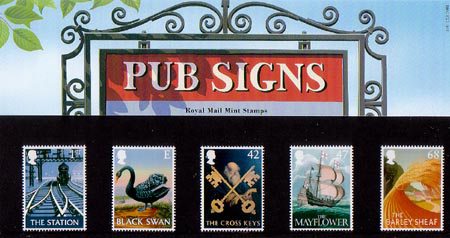
Below I have included the individual stamp designs for the Pub Sign theme of commemorative stamps. I have tried to include both the larger scale designs and the accurate scale of the design in a stamp, which clearly highlights the level of detail that can be seen in the larger and smaller scale. The individual stamps can be seen below:
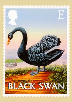
1. Black Swan
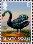
1. Stamp Size
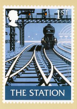
1. The Station
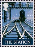
1. Stamp Size
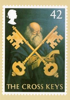
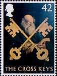
1. The Cross Keys
1. Stamp Size
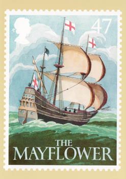
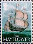
1. The Mayflower
1. Stamp Size
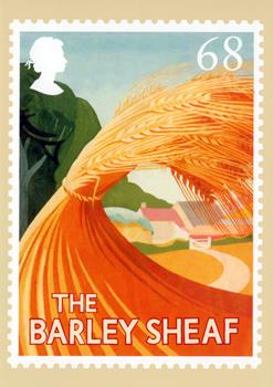
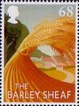
1. The Barley Sheaf
1. Stamp Size
All of the stamps above are a variation or copy of a pub sign, and due to the sign being made with a scale in mind, it makes sense that it would automatically work with a stamps size. When a pub sign is designed, the scale of the piece must be thought about because the sign will be hanging in the air, quite a distance away from the general public, when scaling the signs down for a stamp, the same process is needed here. In addition to this, most pub signs focus on the name of the pub as their main icon, for example, if your pub is called the ‘White Bear’, you are more than likely going to have a white bear on the sign. Therefore the design for a pub sign is generally quite simple to ensure it connects to the name of the pub, because of this, transferring the pub sign to a stamp will follow the same precautions. All in all, the designs above are very relevant for a stamp theme, and work really well at such a small scale, but I am unsure if I want to follow this design route…
One of the deliverables mentioned within the brief states that we must ‘also present our stamp designs(s) as a postcard(s) OR in a commemorative folder.’ I am unsure of how to do this deliverable, but when looking through the Pub Signs Stamps, I soon discovered a presentation pack for the stamps. I am assuming that this is a variation on a commemorative folder, and a possible presentation route I can follow the my final designs. I have placed the presentation pack below:
1. Presentation Pack for Pub Sign Stamps
Overall, the pub sign stamps are very effective stamps, but they are not the design style that I want to follow. Mainly because following this style will exclude all restaurants from being involved in my theme of celebrating hospitality. Because of this, I have the idea and intention of following a building illustration style which would allow me to incorporate all hospitality trades. But whether or not this idea follows the entire building or a section of the building is a different question!