I finished my illustration process off with Thackeray’s in Kent, this is a restaurant that has no affiliation to pubs, but I thought this was a perfect choice to end the commemorative stamp theme because it brought each stamp round to a full circle of hospitality celebration. Again, taking a series of photographs for this building wasn’t an issue becaue my boyfriend is a Chef here, plus the restaurant is local to where i live, making it an easy walk to photograph. As mentioned before, I wanted to work from my own photograph to ensure I bypassed any copyright issues. In all, I think I took around 8 photos, but I decided I focus my illustration on the image I have placed below:
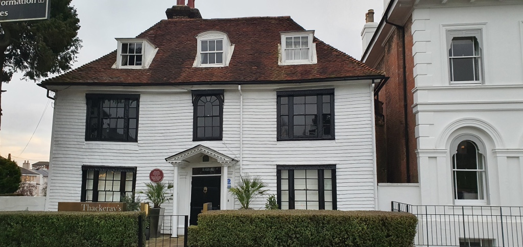
I chose this illustration because it clearly focuses on the building of Thackeray’s, while also showcasing the classic sign that most people in Kent recognises due to it being such a well known restaurant. With the photograph settled on, I wanted to start drawing the outline of the building:
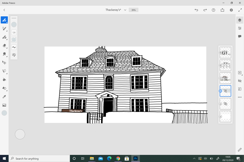
The outline, while easy to draw was difficult to figure out. I decided for ease to illustrate Thackeray’s as the same size as the photograph dimensions. While the made the illustration easy to complete, it was a struggle to remember that the illustration was going to reduced to the size of a commemorative stamp, and I had to keep reminding myself that the level of detail had to be seen from such a small scale. Because of this, I made the decision to space out my line work within the building. For the roof tiles and the panel effect on the front of the building, I doubled the space between the lines (I drew over every second line) which offered more white space between the lines and allowing a clear level of detail to be visible at such a small scale. With the outline completed, I started to work with colour:
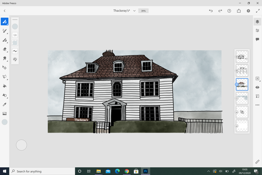
The addition of colour was quite easy to add once I had decided on how to add it. In the building illustrations I had previously researched, the focus of colour was kept very vibrant and bold, similar to a flat vector illustration. I originally thought that this was the route I would follow, but I soon decided against it because I thought the bold and vibrant flat colour would overpower the detailed line work. Due to this, I made the decision to focus on a watercolour effect, it allowed me to subdue the use of colour to ensure the outline is clearly visible while also making the colour I visible aspect in the design with very little detail needed for shading and highlighting. My final stamp design can be seen below:
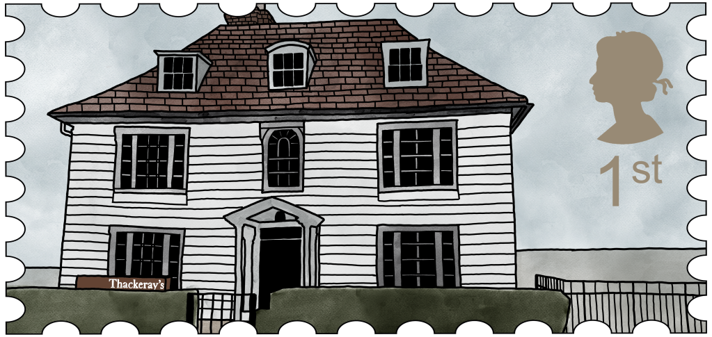
With the illustration process over, I moved from Adobe Fresco to Adobe Photoshop. Here, I turned the illustration into a stamp. I first took a smart vector object of a stamp shape outline, and formed it to the size of my illustration. From here, I took the Magic Wand Tool and selected the empty space on the outside of the stamp shape, and deleted it from my illustration by switching layers. With the stamp shape confirmed, I moved on to including the Queen’s Mark and the 1st definition. The Queen’s Mark was taken from the internet, and I again used the Magic Wand Tool to remove the white background, leaving me with a black shape that I could change the colour of – I decided to focus on the main building colour which I selected by using the Eyedropper Tool to ensure that the colour of the Queen’s Mark wouldn’t look out of place within my final design. Overall, I am quite hapy with how this design turned out, and I think it celebreates the idea of restaurant quite nicely.
