Categories
Commemorative Stamps Conspiracy Theory Final Piece(s) Illustration Options

All Final Pieces for the ‘Options’ Project

We have come to the end of my project! Below I have included all of the final pieces listed within the deliverables as well as the written evaluation:

Conspiracy Theories:

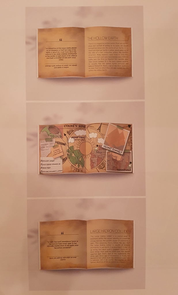
Conspiracy Theory Mockups:

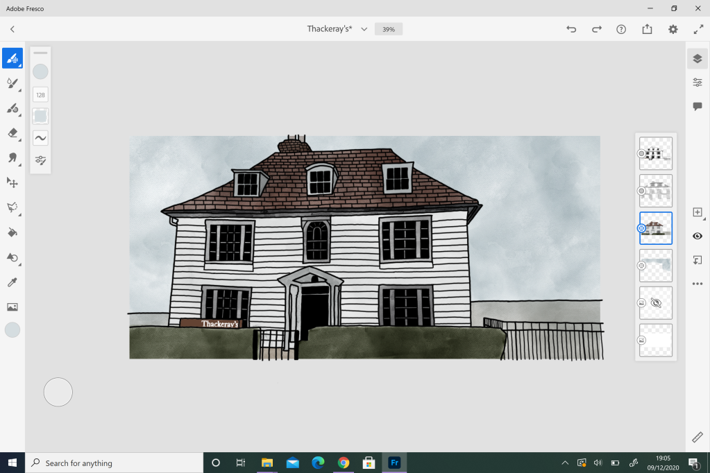
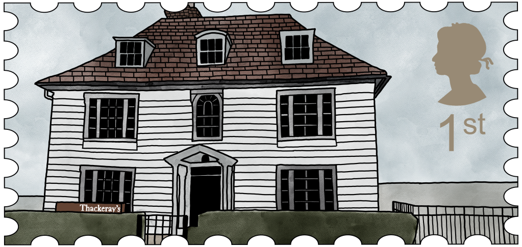
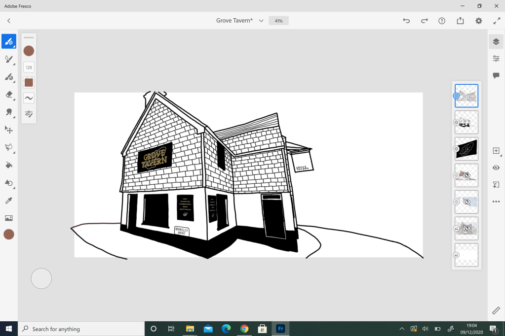
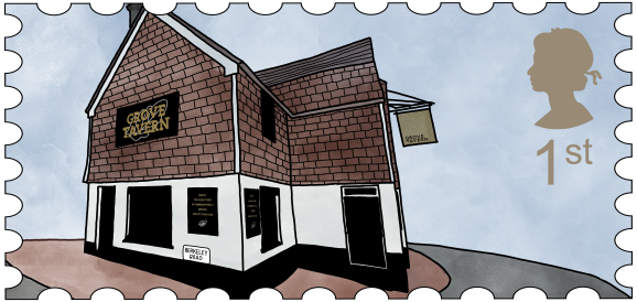
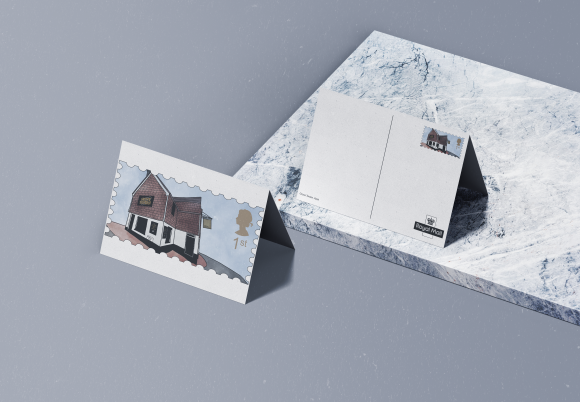
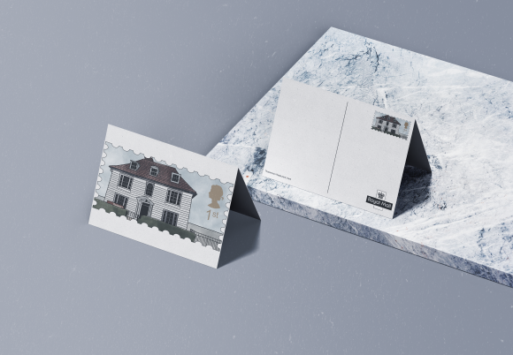
Commemorative Stamps:

Printing Page for the Stamps:

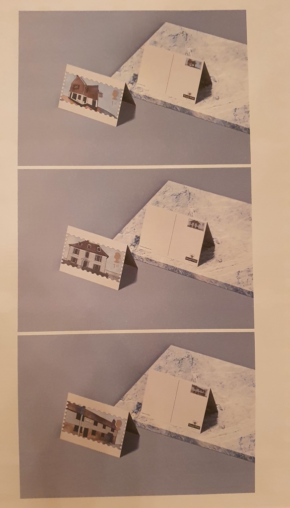
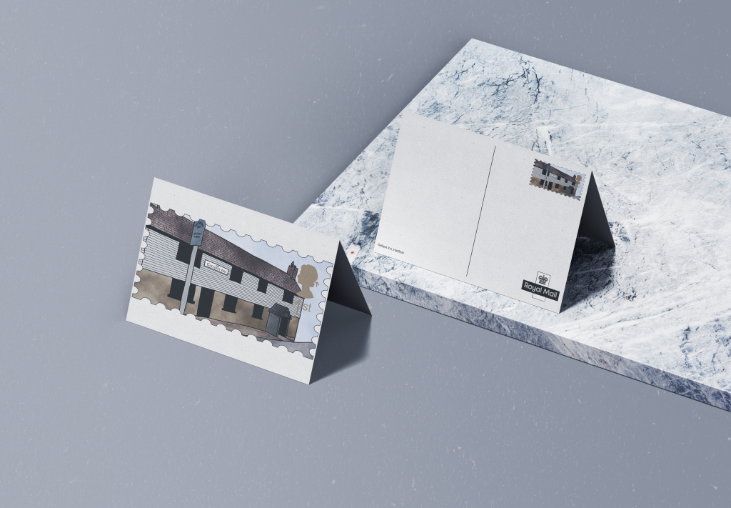
Commemorative Stamps Mockups:

Evaluation:

In what ways does the visual communication/message of the piece meet the needs of the brief?

Conspiracy Theory

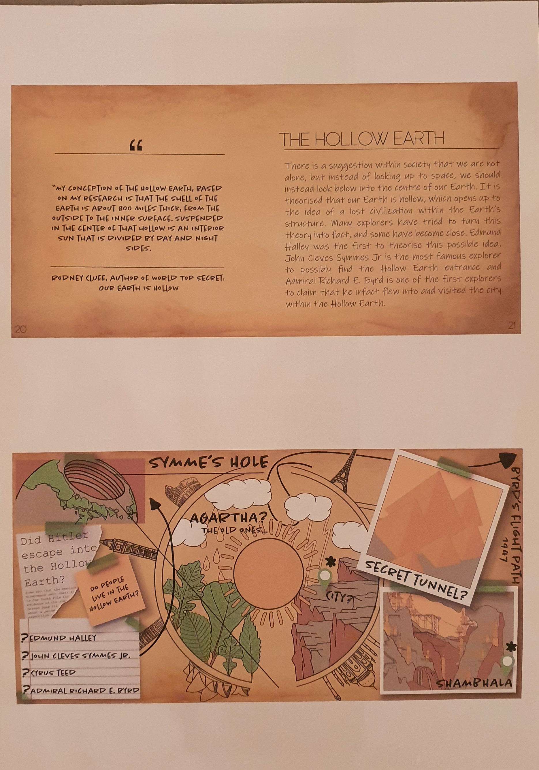
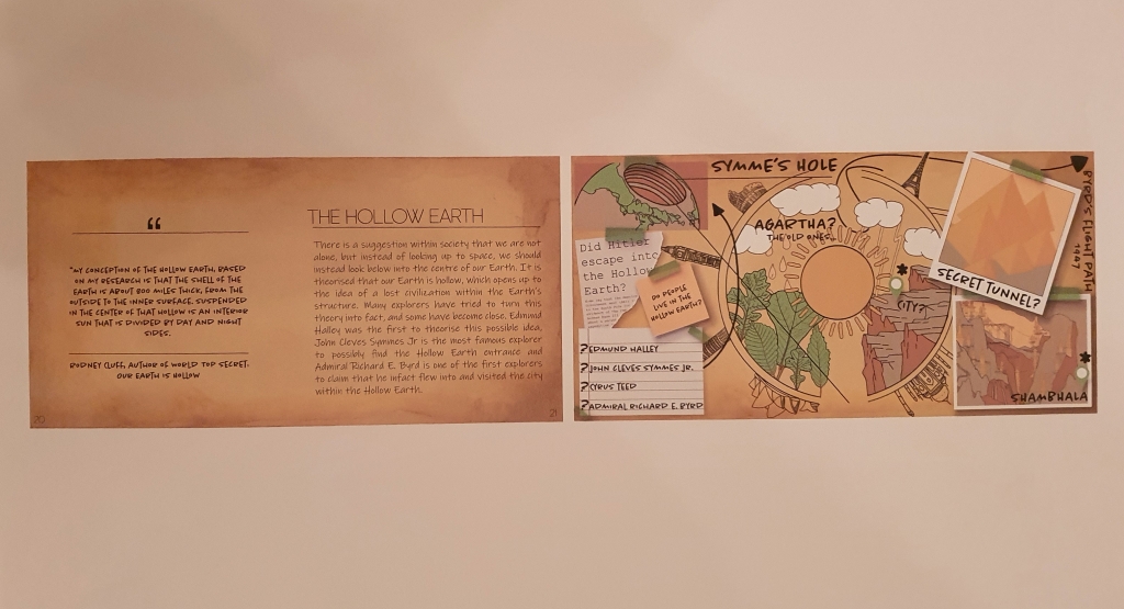
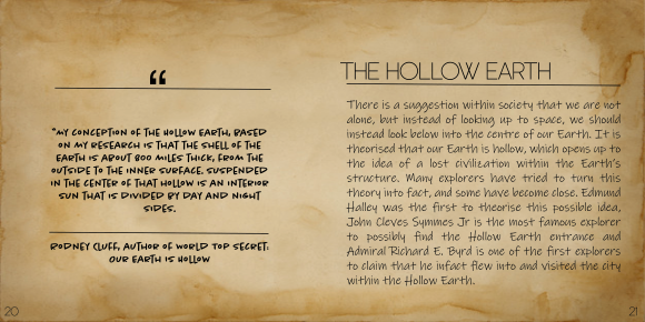
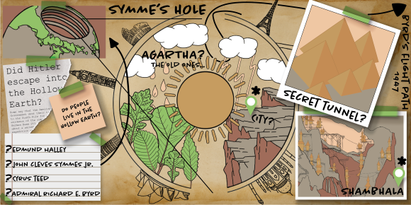
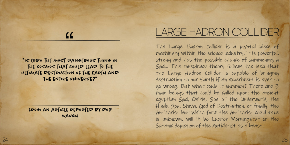
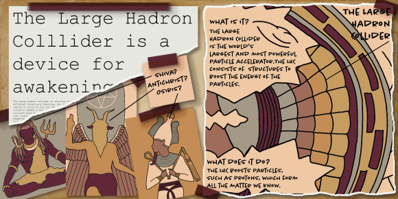
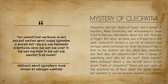
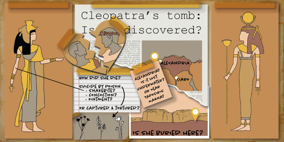
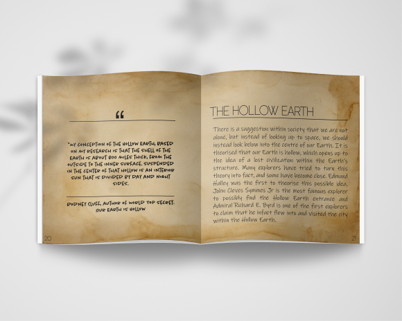
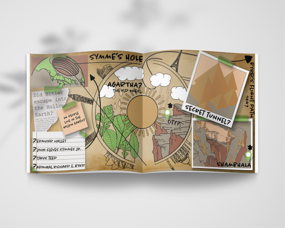
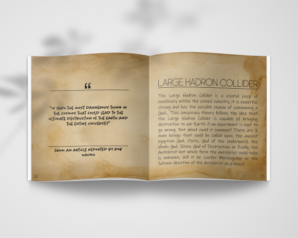
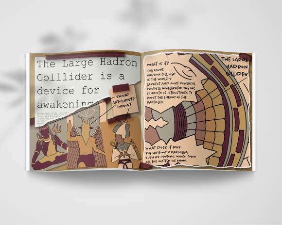
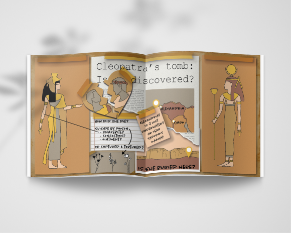
The brief asked us to create 3 illustrations based on 3 conspiracy theories, the overally layout of these illustrations can be designed in anyway. My illustrations followed the idea of an infographic, taking inspiration from a police investigation board and I think my final pieces meet the required needs of the brief. I chose 3 different Conspiracy Theories – Hollow Earth, The Large Hadron Collider is a device for awakening a God and the Mystery of Cleopatra – as for my illustrations, I have done more than 3 on each infographic, but have classed one infographic as one illustration in terms of this project.

Commemorative Stamps

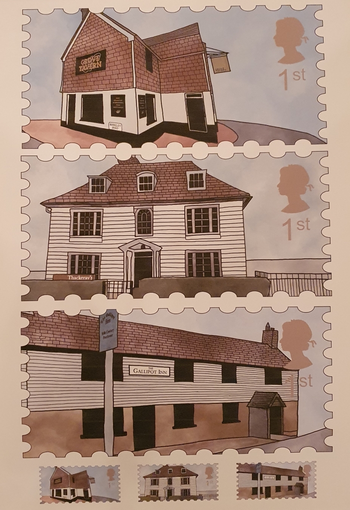
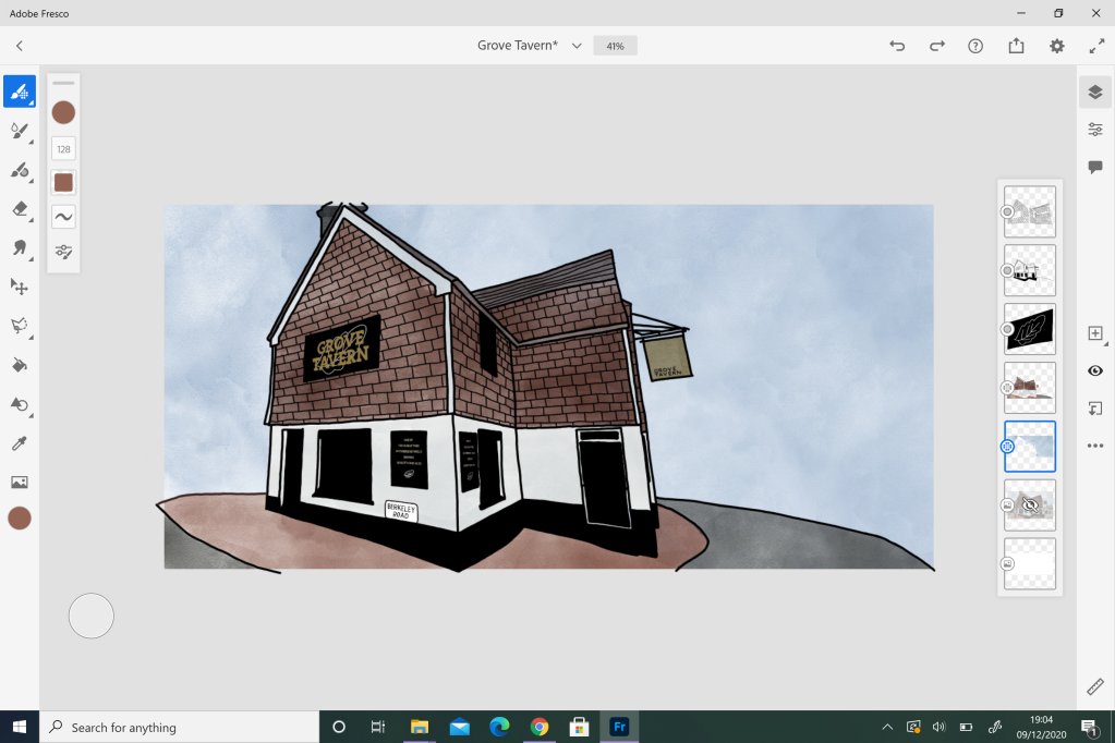
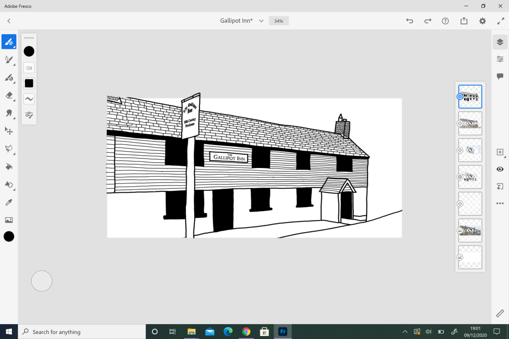
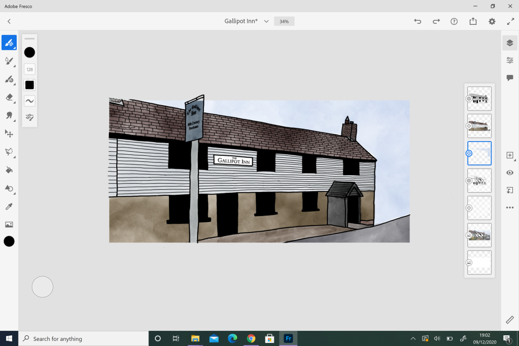
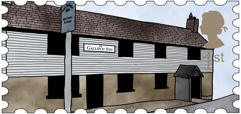
The second part of the project offered a new brief, which asked us to design 2 – 4 Commemorative Stamps, ones that specifically focus on celebrating an idea, concept, object, piece of history or anything at all that would be reasonably featured on a UK stamp. For my theme, I chose to celebrate the hospitality trade after the horrendous year we have just had with the Covid-19 pandemic, and I decided to fall in the middle of the required amount by producing 3 final stamp designs.

In what ways does the visual communication/message of the piece fail to meet the needs of the brief?

Conspiracy Theory

I personally think that my illustrations meet the required needs of the brief, and don’t fail in the ideals of a visual communication or message.

Commemorative Stamps

For the stamps, I think I have met the required needs of a visual communication or message, but I do think that the designs could be improved.

What are the strengths of the visual communication? Why?

Conspiracy Theory

The illustrations I have designed work really well, and when placed into the planned infographic layout they create a strong overall impression of information and facts. Not only this, but each conspiracy theory I have chosen has a selection of signifiers to strengthen the audiences understanding of the theory. In addition to this, I have chosen three conspiracy theories that hold excess amount of information and facts, which allowed me to accurately create and design a well informed infographic.

Commemorative Stamps

As for the stamps, I think my strongest aspect of this project is the illustrations themselves. They clearly resemble the buildings they are based off, and due to the signage for the pubs and restaurants, offer an idea into the hospitality trade. But ofcourse, I think this area could be improved if I had a longer completion time for the project.

What are the weaknesses of the visual communication? Why?

Conspiracy Theory

I personally think that my illustrations and overall infographic layout is very strong, and doesn’t fail in the area of visual communication. Everthing within the final designs has a reason to be there, and with the addition of the information pages, the conspiracy theory can be well understood and the infographics offer all the information and facts as illustrations for the audience to make up their own mind.

Commemorative Stamps

Not everyone will understand the direct link to the hospitality trade, which does bring an issue to the visual communication within the project. However, the designs do hold signs of the restaurant and pubs, which should act as a clear symbol, the only main issue could be the portrayal of the stamp theme.

In what ways could the piece be mis-read or mis-understood by the audience?

Conspiracy Theory

Again, because everything from the cospiracy theory has been included within the infographics, I think it will be quite difficult to mis-read or mis-understand. Each illustration serves a purpose, and the main focus on the final pieces is to express every piece of information/facts that the theory has to offer.

Commemorative Stamps

As mentioned before, I think the overall theme of my stamps could be mis-understood or mis-read. The buildings themselves are clear identifiers of pubs and restaurants, but the theme of celebrating them from coming out the other side of a pandemic could be difficult to see.

In what practical ways could the piece be developed or improved?

Conspiracy Theory

Again, I think these designs are fine as they are. They offer insight into the theory and allow the audience to make their own decision on whether or noth the theory is true. I think the only improvement here would be to have more of them in the same style to create a full book.

Commemorative Stamps

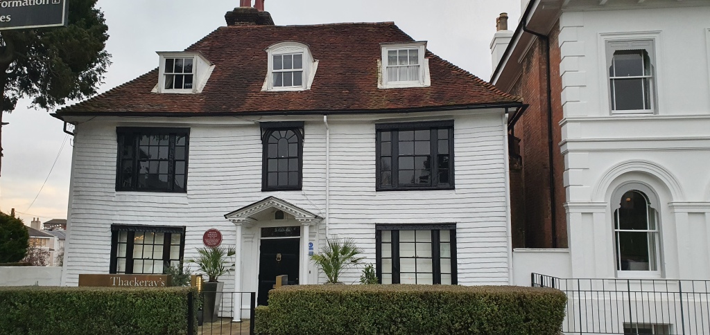
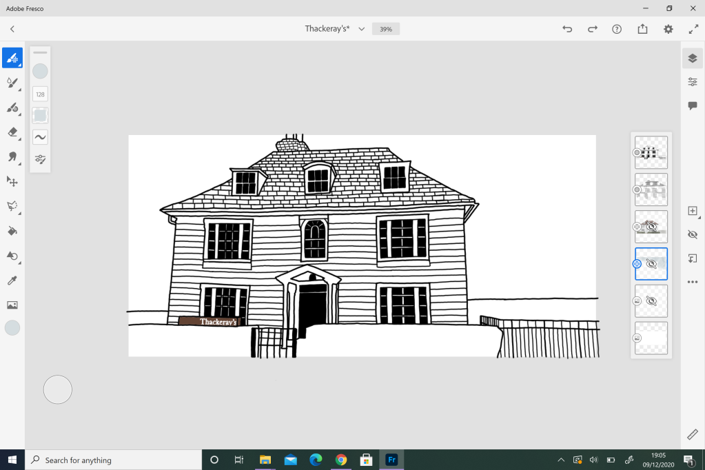
As for the stamps, I think the illustrations could be improved, especially for the Grove Tavern and the Gallipott Inn. Thackeray’s was the last illustration I completed, and because I was facing the building head on, I was able to illustrate the restaurant edge to edge. For the two pubs, I was restricted to standing side on due to the corner of the road and main road being an obstacle. I personally think that the illustration for Thackeray’s is the better illustration because the building does not look alone – I think if I had tome for developing and improving, I would re-take my photographs of the pubs face on, and re-illustrate them with the intention of going edge to edge.

How was my time keeping?

Conspiracy Theory

I feel that for this project I was able to moniter my time more effectively, and the use of my Project Planning book helps to keep me on schedule for blog posts. Due to the long length of time we had to complete this project, I was able to spread my time between research, planning and illustrations quite effectively. And since I finished these illustrations with time to spare, I would say that I worked quite well.

Commemorative Stamps

I have always generally struggled with short time projects, I much prefer longer deadlines because I am able to research effectively and generate ideas over time. But for this two week project, I am quite happy with the work I have produced, especially since I didn’t have to also try and finish my Conspiracy Theory designs. If I had both of these projects going on at the same time, I think I would have produced a lower standard or work as well as feeling very rushed and stressed.

How was my research?

Conspiracy Theory

My research for the Conspiracy Theory project was an excessive amount, and it was probably not needed, but I got in the zone and quite enjoyed it. Within the brief, it stated we must understand and use critical research to our advantage, and I think I took this too literally. The critical research I completed for each Conspiracy Theory was very detailed and full, but if I hadn’t of completed the research to such a high standard, I wouldn’t have been inspired to create a series of infographics and I would be writing an evaluation for a completely different final piece. For me, the research in this project was highly important and inspiring for the final pieces.

Commemorative Stamps

Due to the limited time scale, I tried to complete all my research within the first few days of the project and with this, I made sure to only research the important aspects of the project, not everything that I thought was needed like in the Conspiracy Theory part of the project. Condensing my normal level of research was an important element to focus on here, and if I hadn’t of done this, I would only be starting my illustrations.

How did I draw conclusions from my research? How did I use research to generate and develop ideas?

Conspiracy Theory

I think everything that I drew for this project came from research, and it was only due to my reseach that I came up with the idea of following an infographic route for the final design. Not only this, but it was suggested to us by our tutor that we should look into various different videos that explained the importance of illustration, which helped me to understand the importance of the illustrators job and illustration itself. In addition to this, my use of research is what helped me to determine my illustration style for this project – overall, I think this project would have turned out a lot less sucessful without the conclusions drawn from my research.

Commemorative Stamps

My level of research for this project was shortened, and I had to make a lot of quickfire decisions due to the limited time scale. Overall, I think my research needed more work, but I also understand that if I did more research, my illustrations would have becomed rushed and messy. However, my research for the stamp sizes was very helpful, and it allowed me to generate my own size and scale intention fo the final piece. When producing the mockups, I soon discovered that I needed to do extra research on how the make the postcard mockups look, which allowed me to create a series of mockups that both resembled the Royal Mail aesthetic aswell as supporting my stam illustrations.

How did I use experimentation during the project?

Conspiracy Theory

Experimentation was key for the completion of this project. Before the Interim Crit I showed a few different illustrations for the Hollow Earth Infographic, and it was here that the suggestion of experimentation and developments was spoken about. Ever since the interim crit, I made sure to always look back at possible experiments that could be produced – such creating a more realistic newspaper cutting, experimenting with the torn paper effect for the hadron collider illustration and seperating the heart illustration for Cleopatra’s love interests.

Commemorative Stamps

I have to admit, that I didn’t really focus on experimenting for this section of the project. Due to the limited time scale, I focused on completing the illustrations to the best of my abilty, now I can look back and see areas where I should have experimented, and if I had longer in this project, I would have done exactly that. I think the only slither of experimentation I did for this project was the test prints.

What parts of the project did I enjoy the most?

Conspiracy Theory

Because I had never focused on illustration before, it was quite enjoyable to see my skill set grow and expand from the start of this course. Illustration was something that I never thought I would be able to do, and I was quite nervous when choosing Illustration as my Option. But the process and developments in this specific style of illustration was really enjoyable, and it was even better to see myself achieve something that I never thought I would be able to do. Not only this, but the critical research was quite fun to complete too, once I got interested in the theory I was unable to stop reading more about it.

Commemorative Stamps

Again, the illustration process was the most enjoyable and because I could work from my own interests, I found the whole process to be quite therapeutic. The connection to the hospitality trade plays well into my own life and everyday interests, which made the process of focusing on pubs and restaurants quite enjoyable because it is a common ground for me. What made the entire process was better was how I was able to work with pubs and restaurants that I have a connection to.

What parts of the project did I enjoy the least?

Conspiracy Theory

To be fair, there was nothing that I didn’t enjoy about this project.

Commemorative Stamps

I think the only aspect of this project I enjoyed the least was the time scale, but this is something that I can learn to enjoy with more short deadline projects. I think I need to practice in this area!

Anything else?

Nope, everything was covered above.

Pecha Kucha for Options:

Categories
Commemorative Stamps Conspiracy Theory Illustration Options

Test Prints

Due to the excessive need of an A3 printer, and the struggle it has proven to be at college with everyone needing the printer at the same time due to the deadline, I made the decision to purchase my own A3 printer to have at home – which makes the printing process miles easier! Because of this, I now have the ability to experiment with my designs as test prints before I use the expensive photo paper, and its miles easier to do with my printer because it offers a ‘draft’ printer setting which allows you to see if the sizing, scale and colour is right. I have placed my test prints for each project below:

My first set of test prints are focused on the Conspiracy Theory project. I was unsure on how I wanted to present my final designs within my portfolio, especially since the infographics are partnered up with an information page, so it made more sense to have these two designs on the same page. I first printed the designs in portrait and had the information page ontop of the infographic, but I wanted to try and get the designs to sit ontop of each other in when printed in landscape. This was unachievable, but I did managed to print the designs side by side when in landscape, which carried across the aethestic of a book really nicely. However, I made the decision to print the designs in portrait because it offers a larger representation of the final designs.

From here, I then started to see how I could layout my mockups. In total I have 6 mockups, and I knew I wasn’t going to be print one mockup per page and I also knew that it was unlikely that I could fit all 6 mockups on one page. This is where I tested the idea of 3 mockups per page, which reduces the amount of paper I have to use while clearly offering a large enough view of the designs mocked up as books.

With the Conspiracy Theory project fully printed, I moved on to the Commemorative Stamps. I first wanted to make sure that my designs could fit happily on one A3 sheet of paper as well as clearly showing the designs at a large scale as well as a true-to-size stamp scale. For this layout, I took to Adobe Illustrator and worked with a A3 size document. I decided that the easiest layout would have the three large scale designs taking up over 3/4 of the page when in portrait position and on top of each other with a small gap at the bottom of the page to sit the true-to-scale stamps designs next to each other. My main purpose of having a test print for the stamp project was to ensure that when printed, my accurate stamp sizes didn’t look out of proportion and I think that stamps, when printed, resemble the size of landscape commemorative stamps quite accurately.

I’m not really sure why I did a test print for the stamp mockups. I had already proven to myself that the 3 mockups on top of each other worked well with the Conspiracy Theory version, but I was on a role. And at least with this test print, I can make sure that the sizing is still correct for the actual stamps and the colour palette works for the overall print.

Categories
Commemorative Stamps Illustration Options

Commemorative Stamps Mockups

With my illustrations finished and turned into stamps, I decided to take the next step and make mockups of my Commemorative Stamps. For this, we had two choices of potential mock ups, either a postcard, or a folder/presentation pack. I originally thought I would follow the latter, but I struggled to find a ‘postage stamp folder mockup’ and instead of wasting my time, I decided to quickly move onto a postcard mockup. The mockup I used can be find in the link I have embedded below:

However, before I could start my mockups, my fellow classmate pointed out in our group chat, that Royal Mail postcards follow a specific style. I was unaware of this, and it is only with a quick internet search that I soon learnt what my classmate was talking about. The Royal Mail postcards follow a different style when compared to a classic, everyday postcard and as we are ‘asked’ by the Royal Mail for these stamp designs, the mockups should be similar to their postcard styles.

Below I have placed examples of what the front and back of the Royal Mail postcards should look like. The front should hold the actual stamp, not the design for the stamp and for a clear difference of the stamp outline and the background, it seems to sit on a off-yellow/beige colour.

Royal Mail Star Wars Postcards Eight In a Set
1. Royal Mail Star Wars Postcard

As for the back of the stamp, this remains white. But instead of offering a section to write down the address with lines, the back is empty. Instead, the Royal Mail postcard holds their logo and a small description of the stamp design on the front of the postcard.

STAR WARSPostcards (Eight in a set) | Royal Mail
1. Royal Mail Back of Postcard

With the reference image above, I was able to recreate the Royal Mail postcard back on my own mockup, but the only aspect that I was missing, was the Royal Mail logo. For this, I just used Google, and asked for the ‘Royal Mail logo in black and white’ – I have sourced this logo at the end of my post and place a copy of it below:

Royal Mail Logo PNG Transparent & SVG Vector - Freebie Supply
2. Royal Mail Logo in Black and White

After taking into account the aesthetic of a true Royal Mail postcard, this was my final mockup outcome for my own stamps. I decided that I would take a slightly different approach and use a ‘Folded Postcard’ as the base of my mockup. I made this decision because it allows me to not only showcase both the stamp design clearly, the redesigned postcard back in the Royal Mail guidelines but also the stamp I have designed as an actual stamp in true size. The only part of the Royal Mail postcard aesthetic I couldn’t incoporate was the coloured background and this is only because the background is too similar of a colour for some areas of my designed stamp, especially since I made the decision to have my stamp designs reach from edge to edge. My mockups can be seen below:

Commemorative Stamp Mockups:


Sources

  1. STAR WARSPostcards (Eight in a set) | Royal Mail. 2020. STAR WARSPostcards (Eight in a set) | Royal Mail. [ONLINE] Available at: https://shop.royalmail.com/star-warstm-postcards-eight-in-the-set. [Accessed 10 December 2020].
  2. Freebie Supply. 2020. Royal Mail Logo PNG Transparent & SVG Vector – Freebie Supply. [ONLINE] Available at: https://freebiesupply.com/logos/royal-mail-logo/. [Accessed 10 December 2020].
Categories
Design Volunteers

Protected: Possible Logo Developments

This content is password protected. To view it please enter your password below:

Categories
Design Volunteers

Protected: Meeting Notes : Logo Idea Generation

This content is password protected. To view it please enter your password below:

Categories
Commemorative Stamps Illustration Options

Illustrating Thackeray’s

I finished my illustration process off with Thackeray’s in Kent, this is a restaurant that has no affiliation to pubs, but I thought this was a perfect choice to end the commemorative stamp theme because it brought each stamp round to a full circle of hospitality celebration. Again, taking a series of photographs for this building wasn’t an issue becaue my boyfriend is a Chef here, plus the restaurant is local to where i live, making it an easy walk to photograph. As mentioned before, I wanted to work from my own photograph to ensure I bypassed any copyright issues. In all, I think I took around 8 photos, but I decided I focus my illustration on the image I have placed below:

I chose this illustration because it clearly focuses on the building of Thackeray’s, while also showcasing the classic sign that most people in Kent recognises due to it being such a well known restaurant. With the photograph settled on, I wanted to start drawing the outline of the building:

The outline, while easy to draw was difficult to figure out. I decided for ease to illustrate Thackeray’s as the same size as the photograph dimensions. While the made the illustration easy to complete, it was a struggle to remember that the illustration was going to reduced to the size of a commemorative stamp, and I had to keep reminding myself that the level of detail had to be seen from such a small scale. Because of this, I made the decision to space out my line work within the building. For the roof tiles and the panel effect on the front of the building, I doubled the space between the lines (I drew over every second line) which offered more white space between the lines and allowing a clear level of detail to be visible at such a small scale. With the outline completed, I started to work with colour:

The addition of colour was quite easy to add once I had decided on how to add it. In the building illustrations I had previously researched, the focus of colour was kept very vibrant and bold, similar to a flat vector illustration. I originally thought that this was the route I would follow, but I soon decided against it because I thought the bold and vibrant flat colour would overpower the detailed line work. Due to this, I made the decision to focus on a watercolour effect, it allowed me to subdue the use of colour to ensure the outline is clearly visible while also making the colour I visible aspect in the design with very little detail needed for shading and highlighting. My final stamp design can be seen below:

With the illustration process over, I moved from Adobe Fresco to Adobe Photoshop. Here, I turned the illustration into a stamp. I first took a smart vector object of a stamp shape outline, and formed it to the size of my illustration. From here, I took the Magic Wand Tool and selected the empty space on the outside of the stamp shape, and deleted it from my illustration by switching layers. With the stamp shape confirmed, I moved on to including the Queen’s Mark and the 1st definition. The Queen’s Mark was taken from the internet, and I again used the Magic Wand Tool to remove the white background, leaving me with a black shape that I could change the colour of – I decided to focus on the main building colour which I selected by using the Eyedropper Tool to ensure that the colour of the Queen’s Mark wouldn’t look out of place within my final design. Overall, I am quite hapy with how this design turned out, and I think it celebreates the idea of restaurant quite nicely.

Categories
Commemorative Stamps Illustration Options

Illustrating the Grove Tavern

I continued my illustration process off with the Grove Tavern in Kent, this is a pub that only serves alcohol, classing it as a fully wetled pub. Taking a photograph of this pub wasn’t an issue since it is my family’s pub and I go there nearly everyday to either work or visit my parents and dog. I wanted to work from my own photograph to ensure I bypassed any copyright issues. In all, I think I took around 5 photos, but I decided I focus my illustration on the image I have placed below:

I chose this illustration because it clearly focuses on the building of the Grove Tavern, while also including the pub sign, which is a big and obvious symbol that this building is of a pub, even if the audience don’t know the pub personally. With the photograph settled on, I wanted to start drawing the outline of the building:

The outline, while easy to draw was difficult to figure out. I decided for ease to illustrate the Grove Tavern as the same size as the photograph dimensions. While the made the illustration easy to complete, it was a struggle to remember that the illustration was going to reduced to the size of a commemorative stamp, and I had to keep reminding myself that the level of detail had to be seen from such a small scale. Because of this, I made the decision to space out my line work within the building. For the roof tiles and the panel effect on the front of the building, I doubled the space between the lines (I drew over every second line) which offered more white space between the lines and allowing a clear level of detail to be visible at such a small scale. With the outline completed, I started to work with colour:

The addition of colour was quite easy to add once I had decided on how to add it. In the building illustrations I had previously researched, the focus of colour was kept very vibrant and bold, similar to a flat vector illustration. I originally thought that this was the route I would follow, but I soon decided against it because I thought the bold and vibrant flat colour would overpower the detailed line work. Due to this, I made the decision to focus on a watercolour effect, it allowed me to subdue the use of colour to ensure the outline is clearly visible while also making the colour I visible aspect in the design with very little detail needed for shading and highlighting. My final stamp design can be seen below:

With the illustration process over, I moved from Adobe Fresco to Adobe Photoshop. Here, I turned the illustration into a stamp. I first took a smart vector object of a stamp shape outline, and formed it to the size of my illustration. From here, I took the Magic Wand Tool and selected the empty space on the outside of the stamp shape, and deleted it from my illustration by switching layers. With the stamp shape confirmed, I moved on to including the Queen’s Mark and the 1st definition. The Queen’s Mark was taken from the internet, and I again used the Magic Wand Tool to remove the white background, leaving me with a black shape that I could change the colour of – I decided to focus on the main building colour which I selected by using the Eyedropper Tool to ensure that the colour of the Queen’s Mark wouldn’t look out of place within my final design. Overall, I am quite hapy with how this design turned out, and I think it celebreates the idea of pub quite nicely.

Categories
Design Volunteers

Protected: Logo Idea Generation

This content is password protected. To view it please enter your password below:

Categories
Commemorative Stamps Illustration Options

Illustrating the Gallipot Inn

I started my illustration process off with the Gallipot Inn in Hartfield, this is a pub that also serves food, and I thought this was a perfect connection between a pub that is fully wetled (alcohol only) and a restaurant. To start with, I managed to persuade my Mum to drive me to the Gallipot so I could take some photos of the pub, as mentioned before, I wanted to work from my own photograph to ensure I bypassed any copyright issues. In all, I think I took around 10 photos, but I decided I focus my illustration on the image I have placed below:

I chose this illustration because it clearly focuses on the building of the Gallipot Inn, while also including the pub sign, which is a big and obvious symbol that this building is of a pub, even if the audience don’t know the pub personally. With the photograph settled on, I wanted to start drawing the outline of the building:

The outline, while easy to draw was difficult to figure out. I decided for ease to illustrate the Gallipot as the same size as the photograph dimensions. While the made the illustration easy to complete, it was a struggle to remember that the illustration was going to reduced to the size of a commemorative stamp, and I had to keep reminding myself that the level of detail had to be seen from such a small scale. Because of this, I made the decision to space out my line work within the building. For the roof tiles and the panel effect on the front of the building, I doubled the space between the lines (I drew over every second line) which offered more white space between the lines and allowing a clear level of detail to be visible at such a small scale. With the outline completed, I started to work with colour:

The addition of colour was quite easy to add once I had decided on how to add it. In the building illustrations I had previously researched, the focus of colour was kept very vibrant and bold, similar to a flat vector illustration. I originally thought that this was the route I would follow, but I soon decided against it because I thought the bold and vibrant flat colour would overpower the detailed line work. Due to this, I made the decision to focus on a watercolour effect, it allowed me to subdue the use of colour to ensure the outline is clearly visible while also making the colour I visible aspect in the design with very little detail needed for shading and highlighting. My final stamp design can be seen below:

With the illustration process over, I moved from Adobe Fresco to Adobe Photoshop. Here, I turned the illustration into a stamp. I first took a smart vector object of a stamp shape outline, and formed it to the size of my illustration. From here, I took the Magic Wand Tool and selected the empty space on the outside of the stamp shape, and deleted it from my illustration by switching layers. With the stamp shape confirmed, I moved on to including the Queen’s Mark and the 1st definition. The Queen’s Mark was taken from the internet, and I again used the Magic Wand Tool to remove the white background, leaving me with a black shape that I could change the colour of – I decided to focus on the main building colour which I selected by using the Eyedropper Tool to ensure that the colour of the Queen’s Mark wouldn’t look out of place within my final design. Overall, I am quite hapy with how this design turned out, and I think it celebreates the idea of pub/restaurant quite nicely.

Categories
Commemorative Stamps Illustration Options

Commemorative Stamps : Illustration Plan

With the different stamp layout ideas sketched out, I am now free to start my illustrations! But I wanted to create a rough plan first on how to produce the stamps:

Before any illustrations can take place, I want to first take pictures of my chosen pubs and restaurants. For ease of the illustration process, I want to work directly from a photograph of the building so I can be sure that the scale of the building is correct. This will only be possible if I work from my own photographs, if I was to use a photo downloaded from the internet, my work would fall into the copyright issue and this a key element that all graphic designers want and need to stay clear from!

Once the photographs have been taken, I will work with Adobe Fresco to illustrate the structure and details of the buildinng. Using the already favourited design element of strong, bold lines. The only thing I need to keep an eye on here is the amount of detail I include within the design, it is very important that I keep the true stamp scale in the back of my head so I create a design that will work at a small scale.

I have decided to illustrate the full building to allow the audience to easily see what the ilustration is of and hope, that if they recognise the building, can place it themselves. I’m hoping that by having the full building ilustrated, I will be able to include limited detail to showcase the pub and/or restaurant clearly.

Once the outline has been illustrated, I will then start to include colour, but as I am inspired by all three of the building style illustrations I have previously researched, I am unclear on how colour will be shown within my designs. But I do know that this is an element that I cannot include, in some way, shape or form, colour will be included wihtin my stamps designs.

I am aware that the plan above is quite loose, but it has cleared my head to understand how I should start the illustration process. With my head cleared, I now know how to start the illustration process, and with the limited time left for the brief, this is extremely helpful and has made me feel more confident and capable of completing this project to a good design standard.